📣 Celebrate Lunar New Year with a Lion Dance
When: Sunday, February 6 – 2:00 pm
Where: Somerset Elementary School
Come celebrate Lunar New Year with your Somerset Neighbors!
福虎賀新春,欢迎参加由somerset社区协会举办的虎年春节庆祝活动!
새해 복 많이 받으세요
Chúc mừng năm mới Nhâm Dần. Thân mời bạn cùng tham gia chương trình đón Tết!
The Somerset Community Association has invited an authentic lion and dragon dance troupe and Kung Fu masters to perform at Somerset Elementary on February 6 at 2:00 pm. The event will include a lion dance, dragon dance with drums, and a Kung Fu performance by the Shaolin master and his students!
Did you know that Lunar New Year is celebrated by more people than any other holiday on earth? Lunar New Year marks the first day of the lunisolar calendar based on the cycles of the moon. This year it occurs on February 1, 2022, and begins the Year of the Tiger, as determined by the Chinese Zodiac. Join us to celebrate the beginning of the Year of the Tiger!
Masks are required to attend this outdoor performance. The dancers request that you do not touch their costumes.
You are welcome to “feed” the lion performers (suggested tip amount $1-2). A limited amount of lucky red envelopes for this tradition will be provided by the SCA.
There are some who believe that U.S. home prices will drop in the coming year given last year’s extremely rapid pace of growth, but I disagree. I don’t expect prices to fall; however, the pace of appreciation will slow significantly, rising by around 6% in 2022 as compared to 16% in 2021 (nationally). As such, agents need to be prepared to explain this new reality to their clients who have become very accustomed to prices spiraling upward. Those days are likely behind us—and it’s not a bad thing!
2. Spring will be busier than expected
The work-from-home paradigm is here to stay for the foreseeable future, and this could lead to increased buyer demand. Many companies have postponed announcing their long-term work-from-home policies due to the shifting COVID-19 variants, but I believe they will soon offer more clarity to their employees. Once this happens, it will likely lead to a new pool of homebuyers who want to move to more affordable markets that are further away from their workplaces. I also expect to see more buyers who are driven by the need for a home that is better equipped for long-term remote working.
3. The rise of the suburbs
For a large number of people whose employers will allow them to work from home on an ongoing basis, remote working will not be an all-or-nothing proposition. It will be a blend of working from home and the office. I believe this will lead some buyers to look for homes in areas that are relatively proximate to their offices, such as the suburbs or other ex-urban markets, but away from high-density neighborhoods.
4. New construction jumps
I anticipate the cost of building homes to come down a bit this year as inflation finally starts to taper, and this should provide additional stimulus for homebuilders to start construction of more units. Material costs spiked in 2021 with lumber prices alone adding about $36,000 to the price of a new home. This year, I’m hopeful that the supply chain bottlenecks will be fixed, which should cause prices to moderate and result in a drop in building material costs.
5. Zoning issues will be addressed
I’m optimistic that discussions around zoning policies will continue to pick up steam this year. This is because many U.S. legislators now understand that one of the main ways to deal with housing affordability is to increase the supply of land for residential construction. Despite concerns that increased density will lower home values, I believe existing homeowners will actually see their homes rise in value faster because of these policies.
6. Climate change will impact where buyers live
Now that natural disasters are increasing in frequency and climate risk data is starting to become more readily available, get ready for homebuyers to require information from their agents about these risks and their associated costs. Specifically, buyers will want to know about an area’s flood and fire risks and how they might impact their insurance costs and/or their mortgage rate.
7. Urban markets will bounce back
While increased working from home can, and will, raise housing demand in areas farther away from city centers, it may not necessarily mean less demand for living in cities. In fact, some urban neighborhoods that were once only convenient to a subset of commuters may now be considered highly desirable and accessible to a larger set of potential home buyers. At the same time, this could be a problem for some distressed urban neighborhoods where proximity to employment centers may have been their best asset.
8. A resurgence in foreign investors
Foreign buyers have been sitting on the sidelines since the pandemic began, but they started to look again when the travel ban was lifted in November 2021. Recently, the rise of the Omicron variant has halted their buying activity, but if our borders remain open, I fully expect foreign buyer demand to rise significantly in 2022. Keep in mind, foreign buyers were still buying homes sight unseen even when they were unable to enter the country, and this will likely still be the case if borders are closed again.
9. First-time buyers will be an even bigger factor in 2022
Once remote working policies are clearer, we should see increased demand by first-time buyers who currently rent. In 2022, 4.8 million millennials will turn 30, which is the median age of first-time buyers in the U.S. An additional 9.4 million will turn 28 or 29 in the coming year. I believe this group is likely to contemplate buying sooner than expected if they can continue working from home in some capacity. Doing so would allow them to buy in outlying markets where homes are more affordable.
10. Forbearance will come to an end
Forbearance was a well-thought-out program to keep people in their homes during the height of the pandemic. Some predicted this would lead to a wave of foreclosures that would hurt the housing market, but this has not been the case. In fact, there are now fewer than 900,000 U.S. homeowners in forbearance, down from its May 2020 peak of almost 4.8 million, and this number will continue to shrink. That said, there will likely be a moderate increase in foreclosure activity in 2022, but most homeowners in this situation will sell in order to meet their financial obligations rather than have their homes repossessed.
Content by Matthew Gardner, Chief Economist for Windermere Real Estate
Depending on the situations thrown your way, you may face home-changing needs. This means you should investigate your situation and determine if you need to sell your home and find a new one. After all, you don’t want a large home to clean if you don’t need it. On the other hand, you may need a larger home to house your family. Make sure you think about these four points to see if you need to change your home.
You Plan to Retire Soon
Some people plan to enter retirement after they save enough money. When you reach this point, you should think about your home and if you should keep it. For example, you may have less money when you retire, so you may need to seek a smaller home to accommodate for it. Otherwise, you could find yourself with too much property tax compared to your income.
In short, you should cut down on your house expenses if you plan to retire, so you can avoid financial problems later on. You can do this by selling your home, buying a different one, and pocketing the leftover money for future use.
You Want to Start a Family
Some people may want to start a family of their own. If you find yourself in this position, you need to consider your current home. For example, an apartment might work for a couple or one person, but you need a small home if you want a child. If you plan to have a bigger family, you should look into houses with multiple rooms, so you can ensure everyone has enough space to remain comfortable.
While a larger home may cost more money, you need to consider this investment if you plan to have a family. Otherwise, you run the risk of too many people in not enough rooms, leading to problems in the home.
Your Children Left or Went to College
As you raise your children, they will eventually reach a point when they leave the house or go to college. When this happens, you need to think about the large home you currently own. For example, if you have a larger house with four or five rooms, you won’t need as much space when your children grow up. This means you should consider selling your house and getting a smaller one.
While it shouldn’t matter if you have the money, you need to think about home maintenance. You may want to downsize, so you don’t have to clean as much.
You Recently Got a New Job
Depending on your financial situation, you should investigate your home-changing needs. For example, you may have more money from your job or less money because you got a different job. Based on the money you have available; you may need to find a smaller home. On the other hand, if you find yourself in a comfortable position and want a larger home, you can seek a renovation instead.
New jobs can greatly impact your home needs. For example, your job may require you to move, so if this happens, you should think about the price range you want to aim for based on the new area you plan to live in.
Conclusion
As you focus on your home-changing needs, you can see if you need to renovate your home or move somewhere else. You need to understand what you plan to do in your life soon, so you can determine what changes you need to make to your house. If you want to see what properties you should consider, let’s connect to chat about your changing needs and options.
Once in a while, there’s that one kind of house that you’re just head over heels about. Funny enough, you may not even realize that you need a house until you come across your dream home. Once you set your mind on buying it, you may want to consider contingencies to protect yourself financially. Whether you’re acquiring a home to live in or it’s an investment property, contingencies can help you evade a costly mistake.
Contingencies tend to give you higher authority over the home-buying process with an opt-out clause in case things don’t go as expected. Buying a house involves getting into a legally binding contract with the seller. With a profound understanding of contingencies, you can begin the home-buying negotiations with greater confidence.
What Does Contingent Mean in Real Estate?
In a real estate contract, contingent means that a buyer has initiated a purchase offer and the seller has accepted the offer. Notwithstanding, the contract is conditional upon some things occurring, and the deal’s closing will not occur until those things have happened. If the set things fail to occur within the stated time, the deal is canceled without any legal consequences. Any contingency ought to be clearly stated so that both the buyer and seller have a better understanding of the terms.
Here are a few examples of the most common contingencies for buyers:
1. Inspection Contingency
A home inspection contingency means that if the inspector finds problems with the home during the inspection, you can walk away from the contingent offer as a buyer. The inspector typically checks both inside and outside the home for any signs of damage or wear and tear. The inspection takes place within days of creating a contingent offer so that you can decide if to continue or walk away from the sale.
2. Mortgage Contingency
A mortgage contingency is a clause written into a property sale agreement that can terminate the sale if certain conditions aren’t met. This clause offers protection to both the buyer and the seller in case the buyer doesn’t secure mortgage financing. It also specifies when an official approval for a mortgage is to be made. If any party backs out before the mortgage money is secured, then there are no penalties.
3. Appraisal Contingency
When applying for a loan, the lender may decide to hire a third-party appraiser to assess the property’s fair market value to make sure that their investment in you doesn’t go to waste. The appraisal contingency makes sure that you’re safe if the property’s sale price is a bit higher than the property’s appraised value. The contingency includes dates by which you ought to alert the seller in case of any inconsistencies between the appraisal value and the selling price, giving them an opportunity to negotiate the price.
4. Home Sale Contingency
This means that buying a new home is contingent on your ability to sell your current home. The contingency states that if you have sold your home by a certain date, you can buy the new home, and the deal will continue. If you fail to sell by that date, the deal is either extended or canceled by the seller.
A seller can also include some clauses to protect themselves, and the most common is a “kick-out” clause.
What’s A Kick-Out Clause?
A kick-out clause seeks to protect the seller by giving them a right to continue marketing their home if they receive an offer with contingencies that need to be met. If the buyer delays the process because they are unable to sell their home, the seller can put this clause into effect. The clause gives the seller a chance to switch to a buyer capable of completing the sale.
Final Thoughts
Whether for the buyer or seller, contingencies in real estate can have a huge impact on the sale. As a buyer, they can give you a lot of protection in the home buying process. And having a better understanding of the most prevalent contingencies and what they stand for gives you a rising awareness of what to leave out and what to include.
Ready to learn the ins and outs of contingencies in real estate? Let’s connect to chat about your real estate questions or needs.
When it comes to selling your home, you want to see the best possible results of the sale. After all, you can only sell it once. When you ask yourself the best possible result of the home sale, naturally, your first thought is to sell for top dollar. You want a realtor who can make your house shine, show off its best features, and find buyers who will bid well over the market value. Of course, you also don’t want the sale to take forever, delayed by renovations or losing value sitting on the market for months.
To see the best results of a home sale, you need a strong real estate partner. Your agent and brokerage are an important part of the home-selling team and their expertise plays an important role in both optimizing your home’s appeal on the market and swiftly finding a buyer who is ready to commit to a top-dollar price.
So how do you find the ideal real estate agent to work closely with you, sell your house quickly, and get the best price for the property value? Here’s how you can get started:
A Real Estate Agent Who Understands You
Selling a home is a team effort, so you will need someone you can talk to easily. You need someone who you understand when they explain the home selling process and someone who understands you when you explain your priorities and budget. An agent who doesn’t listen makes decisions without checking with you, or who doesn’t speak clearly with you isn’t a good partner, so it’s okay to interview a few agents before you find the right one that “clicks”.
Communication is key, so build a rapport quickly. Share your ideas about selling and listen to your agent’s advice so you are both on the same page. Then decide what to do together, using their expertise and your situation as guiding points.
The Windermere Real Estate Boost
Home sellers planning for pre-sale renovations with a Windermere agent (like myself) also gain the benefit of the Windermere network and the Windermere Ready experience. Windermere is the largest residential real estate firm in Puget Sound and specializes in luxury real estate with a dedicated network of home service and real estate professionals available to tap at any time.
Windermere Ready is a no-interest home improvement loan and access to a network of awesome home services providers that can be accessed to make any pre-sale updates and staging to sell your home. If you want or need to make a renovation before selling to increase the final sale price, you gain access to trustworthy teams, guided improvements, and the work is covered when your home sells at a higher market value.
Knowing Your Local Buyers and Housing Market
Of course, good decor and rapport aren’t all that sell a house. If you really want to sell for top dollar, it’s important to motivate your buyers. And to do that, you need an agent who knows the local market. Who is looking for homes in your neighborhood, and what do they want to see in a house? In the greater Seattle area, the local draw could be anything from boho chic to glass-tower modern. Your area might be drawing families, retirees, vacation homebuyers, or solo professionals focused on a now-hybrid home/work career. Should the walls be blue-gray or honey-brown? Should you stage in stainless steel or woven-and-wicker?
The right staging is whatever inspires your local buyers to fall in love with the house, to suddenly imagine themselves living there, and begin writing their future before the tour is over. A real estate agent who knows the area and the buyers can help you inspire not eager buyers, but those inspired to bid well above listing to ensure you choose their bid first.
Closing Quickly on the Best Offer
Last and certainly not least, a great real estate partner will help you close swiftly on the best bid. When a top bidder arrives or the bidding flurry settles into the highest verified bid, your agent will help you choose, escrow, negotiate, and close without wasting time. Homes lose value as they sit on the market, and they can take ‘vacancy’ damages if closing drags on. A great real estate agent will ensure your home is listed, sold at a high value, and closed before it has time to get dusty inside, much less cool on the market.
Do you need to sell a home quickly and for the best possible price? I know exactly where you are standing, I’ve been there myself. With over three decades of listening to my clients before we make a plan, you can know that I will help you make all the right decisions for your property, situation, budget, and timeline. Whether you’re selling a house in a rush or just want to sell for top dollar, let’s connect to chat about your goals. We’ll get your home sold quickly and for top-dollar together.
Nestled on one of the most exclusive streets in Somerset sits this sophisticated & elegant NW Contemporary home featuring expansive views, total privacy & special finishes.
4630 139th Ave SE, Bellevue WA 98006
Offered at: $2,680,000
This 4 bedroom, 4 bath, 4,310 square foot Somerset home has exquisite finishes throughout. Cherrywood hardwood floors that span throughout the main spaces in the home are beautifully maintained. A chef’s kitchen that is suited for any level of cook and perfect for entertaining. No expense was spared, with high-end appliances to support all of your cooking needs. The kitchen is accompanied by a wet bar that is perfect for an end-of-day beverage or entertaining.
The entire home offers a unique and stunning experience through the floor to soaring ceilings which offers an open and expansive feel throughout. Walls of glass bring a one-of-a-kind view of the city, lake, and mountains, a beautiful and perfect oasis to retreat to right from the comforts of your home.
The master suite is generously spaced and features a beautiful fireplace and floor-to-ceiling windows with territorial views. The suite is accompanied by a high-end en-suite with no area left untouched. A stunning soaker tub with beautiful views, shower complete with a rain shower, and custom design.
Located at the top of Somerset Hill, this home is close to Somerset Elementary and part of a wonderful and highly sought-after community. Ready for a unique, stunning, and turn-key home? You’ve found it.
Inside Scoop: You absolutely can sell a home as-is, without renovations. You can even sell a home without even lifting a finger! It all matters who you list with.
How much can you make with your home sale? How much will it take to renovate your home to get its best price on the market? As it turns out, all that renovation often isn’t necessary. Many homeowners can get a great price after just a little cleaning and staging – provided you’re working with a real estate agent who knows their stuff. It’s rarely mentioned, but who you list with matters. There’s a difference between a weekend agent handling your sale in their own free time and someone who’s been dedicated to Seattle Eastside area real estate for over thirty years of hands-on market experience. Someone who lives, works, and breathes the area and knows exactly what it will take to get you the highest dollar for your home, and quickest sale.
The right real estate agent will see the potential for your home, know the neighborhood values, and help you connect with motivated buyers who want to give you a great price. I recently listed a home in SE Bellevue which sold as-is at the second-highest price per square foot in the Somerset neighborhood. The only home value that topped our recent sale had been recently remodeled while our home sold from the original owners without a single remodel or update.
The Home’s First Sale, Sold As-Is by the Original Homeowners
The challenge was set. When the SE Bellevue homeowners came to us, they had two goals. First, they wanted to sell the home for a good price and, second, they didn’t want to do any renovations. The home was to sell as-is, without renovations or updates after decades of being lived in by the original owners!
Usually, real estate agents lean on minor home renovations to make a decades-old home competitive on the modern housing market. In many cases, the increase in selling price only barely offsets the value of the renovations. Selling at a good price without renovations could easily result in more profit for the seller. We could see why our seller wanted “no renovations”, so that’s what we did.
We’re proud to say that our efforts resulted in a sale over $400K above the listing price within a week on the market.
How We Prepared for a Fantastic As-Is Sale
So how do we transform an as-is home into a highly competitive listing? My team got to work with a quick and effective strategy to make the as-is home feel welcoming and inspiring to local home buyers. We first removed personal items then cleaned, staged, and professionally photographed the home. The photographs and our now-intimate knowledge of the home helped us create a powerful listing that quickly produced a cash buyer and a one-week close.
Clearing and Deep-Cleaning
The first step for any home sale is deep cleaning. We scrub the grout, steam-clean the carpets, washed the windows, and polished the fixtures. We got this home as close to like-new as possible on the interior and gave the exterior a quick touch-up to spotlight the gorgeous architecture and mature landscape design. And boy did it shine!
Staging the Home
Stating is an artistic way to arrange sample furniture and decorations inside a home. Staging gives buyers a clear idea of how big rooms are, what they are for. Staging uses interior design elements to show off the best features and design potential of each room. We aim for each room to inspire buyers to imagine the life they could live in the staged home.
We staged this Bellevue Somerset home with a cozy contemporary style popular in the area. Its sunset views and multi-layer design made it easy to use natural light a warm color scheme to show the home’s best side.
Professional Photograph Tour
Professional photography is a must. Bridging in a professional ensures every angle is perfect and the photos will capture the essence of the home, not just the images. A professional photographer can design a photo tour that feels like walking through the home, and they know how to catch the best features in every angled shot while giving buyers a real idea of the space.
The Final Result: An Incredible As-Is Sale in Bellevue
After listing the home with a glowingly detailed description and professional photographs, we rapidly received nine sure bids from local buyers and closed within a week with a cash-sale more than $400,000 above the original listing price.
This home sold for such a great value because we knew the neighborhood, the buyers, and we brought the home’s potential to the surface. Buyers of as-is homes are often ready to improve the home independently and don’t need sellers to do a thing. A great opportunity for buyers to get into a great home in a great neighborhood and the sellers to pocket some great money! From the way we stage to the way we list; I leverage my 30 years of industry experience living and working in the area to help your as-is sale connect strongly with local buyers.
Can you sell your home as-is and still get a great selling price? Absolutely. It all depends on your local market and partnering with a truly effective real estate agent who knows your market like the back of their hand. If you are selling in the Seattle and Bellevue area and don’t want to renovate, my team can help turn your sale into an as-is success story. Let’s connect to talk about your plans for your home, whether it be selling today, or setting up a plan for the future.
This video is the latest in our Monday with Matthew series with Windermere Chief Economist Matthew Gardner. Each month, he analyzes the most up-to-date U.S. housing data to keep you well-informed about what’s going on in the real estate market.
Hello there! I’m Windermere Real Estate’s Chief Economist, Matthew Gardner, and welcome to the latest episode of Mondays with Matthew.
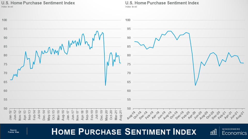
Today we are going to take a look at the latest Home Purchase Sentiment Index survey that was just put out by Fannie Mae. And for those of you who may not be familiar with this survey, it’s actually pretty important and one that I track closely as it’s the only national, monthly, survey of consumers that’s focused primarily on housing.
The survey shows the responses of 1,000 consumers across the country to roughly 100 survey questions on a wide range of housing-related topics. Now, don’t worry, we aren’t going to look at all 100 questions – just the ones that solicit consumers’ evaluations of housing market conditions and that also address topics related to their home purchase decisions.
So, as you can see here, the overall index was trending higher pretty consistently until the pandemic happened which had massive, but temporary, impacts. And looking at the last 3-years, you can get a better idea as to the speed of the pandemic-induced drop – pretty remarkable.
Now, you will also see that the index recovered quite quickly; however, it fell again last fall as the pandemic was not going away at the speed many had hoped for – it rose again this spring but has been pulling back for the past few months but, that said, the August index level essentially matched the level seen in July.
Now let’s look at the questions that are used to create of the index number and how consumers responded.
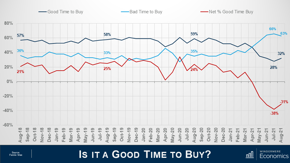
When asked whether it was a good time to buy a home, the percentage who agreed with that statement rose from 28 to 32%, while the share who thought that it is a bad time to buy dropped from 66 to 63%. And, as a result, the net share of those who say it is a good time to buy jumped 7 points month over month, and it’s notable that this is the first time the net share number has improved in the past 4-months.
What I see here is that – although improving modestly, the general consensus is that it is not a good time to buy and that sentiment is being driven by two things: One – there are still not enough homes on the market, and two, rapidly rising prices are scaring some people.
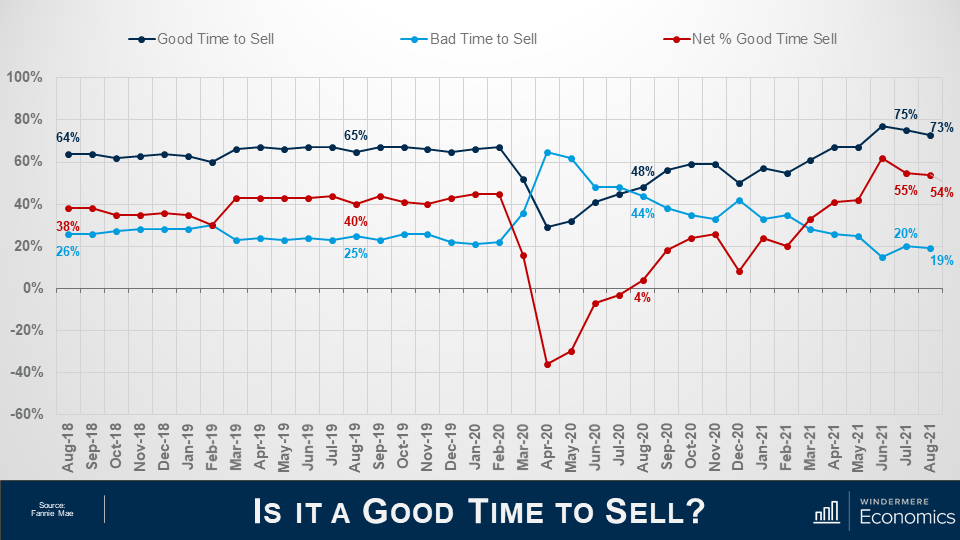
And when asked if they thought it was a good time to sell their homes it was interesting to see that share drop from 75 to 73% while the percentage who said that it’s a bad time to sell dropped 1 point to 19% and as a result, the net share of those who said it was a good time to sell pulled back by 1% but it still indicates that more owners think that it is a good time to sell than don’t.
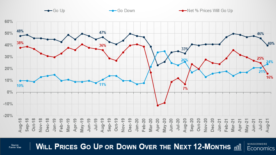
Looking now at the direction of home prices over the next 12-months, the percentage who think that home prices will rise fell from 46 to 40%, while the percentage who expected home prices to drop rose from 21 to 24%.
As a result, the net share of Americans who say home prices will go up dropped by 9 points – from 25%, down to 16%.
Although this may sound concerning, I should add that the share of respondents who thought that home prices will remain static over the next year rose from 27% to 31%.
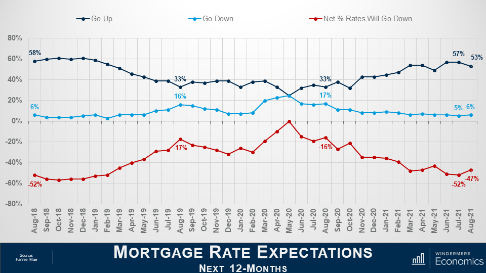
On the financing side, the share who think mortgage rates will rise over the next 12 months dropped from 57 to 53%, while the percentage who believed rates would be lower rose from 5% to 6% and, as a result, the net share of Americans who believed that mortgage rates will go down over the next 12 months rose by 5%, and with 35% of respondents thinking that rates will hold steady – it’s clear to me that a vast majority are not worried about mortgage rates rising.
The takeaways for me so far are that consumers tempered both their recent pessimism about homebuying conditions and their upward expectations of home price growth.
Most notably, a greater share of consumers believe that it’s a good time to buy a home – though that population remains firmly in the minority at only 32% – while the ongoing plurality of respondents who expect home prices to go up over the next 12 months dropped but was still well above the 24% of consumers who believe home prices will fall.
Now, there are two more questions that are worth looking at which aren’t directly related to home buyers and sellers but are still important as they look at employment and incomes.
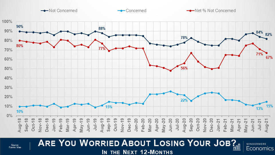
The percentage of respondents who said that they are not concerned about losing their job in the next 12 months remains very high at 82%, but it did drop by 2 points month-over-month, while the percentage who said that they are concerned ticked up to 15% from 13%. As a result, the net share of Americans who say they are not concerned about losing their job fell by 4 percentage points month over month, but remains well above the level seen a year ago.
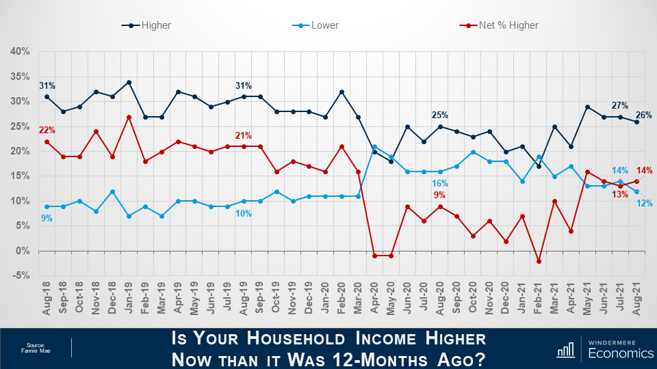
And finally, when households were asked about their own personal finances, the percentage of respondents who said that their household income is significantly higher now than it was 12 months ago pulled back one point to 26%, while the percentage who said that their household income is significantly lower dropped to 12%.
As a result, the net share of those who said that their household income is significantly higher than it was a year ago rose by 1 percent month over month and came in 5 points higher than a year ago. It’s also worthwhile noting that most said that their household income is about the same as it was a year ago with that share rising from 56 all the way up to 59%.
Looking at all the numbers in aggregate, the index level was relatively flat in August with three of the index’s six components rising month over month, while the other three fell, and that tells me that the continued strength of demand for housing and definitely favorable conditions for home sellers may well be offsetting broader concerns about the Delta variant of COVID-19 as well as rising inflation that have both negatively impacted other consumer confidence indices.
Most consumers continued to report that it’s a good time to sell a home – but a bad time to buy – and they most frequently cite high home prices and a lack of supply as their primary rationale.
However, the ‘good time to buy’ component, while still near a survey low, did tick up for the first time since March, perhaps owing in part to the very favorable mortgage rate environment as well as growing expectations that home price appreciation will begin to moderate over the next year. A sentiment that I personally agree with.
Well, I hope that you have found this month’s discussion to be interesting. As always if you have any questions or comments about this topic, please do reach out to me but, in the meantime, stay safe out there and I look forward the visiting with you all again, next month.
Here is the latest update from Matthew Gardner with an in-depth look at the current housing market.
Hello there! I’m Windermere Real Estate’s Chief Economist, Matthew Gardner, and welcome to a rather special episode of Mondays with Matthew.
Why special? Well, regular viewers of my videos will know that I generally take this opportunity to give you an update on the housing related numbers that came out in the month, but this time we are going to go in a different direction.
A few weeks ago, I was asked by the real estate publication, Inman, to pen an op-ed that would offer a counterpoint to this one that they had just published.
Well, I think that many of you will agree that it’s a pretty direct position and – judging by the comments I read following its publication – was certainly one where readers were very firmly on one side of the fence or the other!
Those of you that know me at all will probably have already figured out my position on this. I went ahead and crafted my response and I do take a different view on the matter!
As I am sure that some of you don’t have access to Inman’s website, I thought it might be interesting to share with you the reasoning behind my belief that we are not about to enter a period of declining home values; but even if you are an Inman subscriber and did read the piece, I hope that you will still find this video worth watching as I will also be sharing some of the background data with you that was not included in the article, as well as to give some more context on the subject.
Home Prices Out-Pace Wages
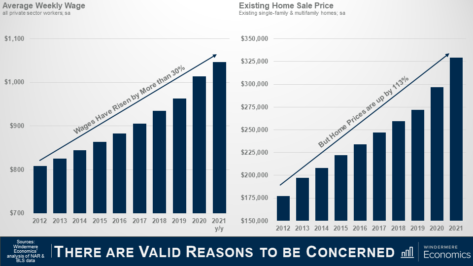
But to start with, I must acknowledge the fact that home prices have been rising at a significantly faster pace than wages for several years now and that may well be part of the reason why some people in the industry – and some perspective home buyers – are getting concerned.
As you can see here, since 2012, average weekly wages have risen by a little more than 30%, with the average annual gain of around 2.3% which is actually not that bad. Wages also rose by over 6% last year, which sounds great, but in reality, it was because of the pandemic. You see, most of the job losses were in low-wage sectors which skewed the data upward – but I digress.
Anyway, during the same time period, you will see that even as wages rose, home prices have taken off and wage growth has simply not kept pace.
I often think about a quote from the Spanish philosopher and novelist, George Santayana, “Those who cannot remember the past are condemned to repeat it” which I think just about says it all!
Timeline
So, what we are going to do today is to take a look back and run through a brief timeline of events that led to the 2007 crash, and then look at where we are today and how it is totally different which leads me to speculate that there is no real reason why we should expect to see a widespread, systematic decline in home prices in the foreseeable future.
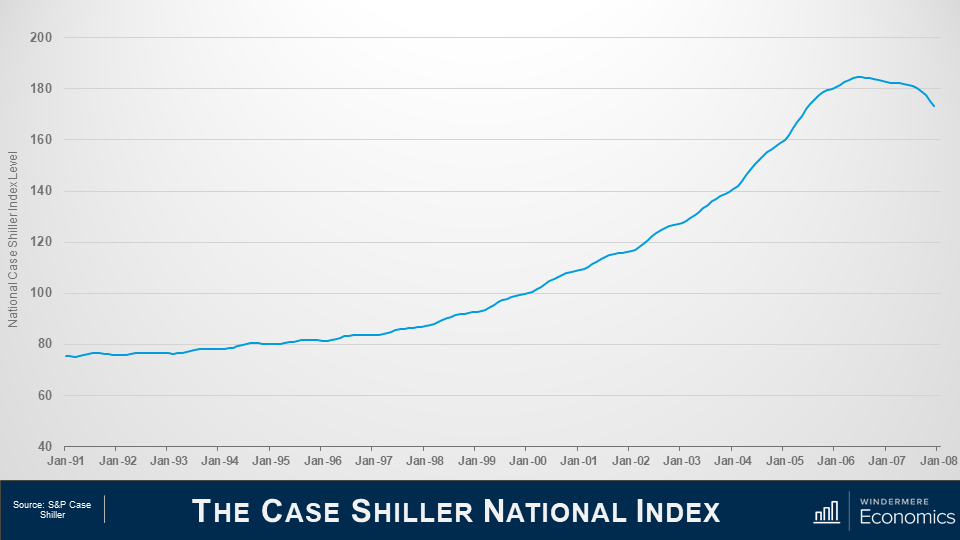
This first chart shows the Case Shiller National Home Price Index level over time and we’ll be using it as a base for this part of the discussion.
If you are not familiar with Case Shiller, its what’s known as a repeat sales index – which means that it looks at the change in sale prices between when a home was purchased and when it was sold and is a great way to look at changes in home prices.
Let’s start all the way back to the early 1990’s.
1992
In ’92, Congress enacted Title 13 of the Housing and Community Development Act and they did this to give low- and moderate-income borrowers better access to mortgage credit via loans supported by Fannie Mae and Freddie Mac.
1995
And in ‘95, President Clinton introduced a National Homeownership Strategy which had a very aggressive goal of raising homeownership levels from 65.1% to 67.5% by the year 2000 – that would be a rate of ownership in America that had never been seen before.
But this could only realistically happen if Fannie & Freddie significantly increased the share of mortgage funds going to lower income households. The Housing and Community Development Act required them to dedicate 30% of their portfolio to lower income borrowers – but the Clinton plan meant that they had to raise that share to 42%.
And it started out rather well with almost 2.8 million new homeowners created between 1993 and 1995 – and that was double that seen during the prior two years.
And because of the increase in demand that would come from greater loan volume, Fannie and Freddie moved to an automated underwriting process to speed up loan approvals. Interestingly, this then became an industry norm – but in going to an automated model, all they really did was to significantly relax the underwriting approval process.
1999
Now moving on to the very end of the decade, in November of 1999, Congress passed, and President Clinton signed, the Gramm-Leach-Bliley Act which, amongst other things, lifted most of the restrictions that prohibited any one institution from acting as any combination of an investment bank, a commercial bank, and an insurance company that were prohibited by way of the Banking Act of 1933 – otherwise known as the Glass-Steagall Act.
Now this is important as – in essence – banks could now underwrite and sell banking, securities, and insurance products and services which included, guess what, mortgage products.
2000
In 2000, the dot-com bubble burst. Something those of us here in Seattle remember all too well – and one of the major consequences of this was that investors moved away from the equity markets and, instead, turned their attention to the real estate market.
2001
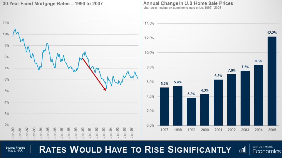
By the start of 2001, the country was heading into a recession, and even though unemployment remained close to a 30-year low, the Federal Reserve wanted to stimulate borrowing and spending, so they started to lower short-term interest rates very aggressively.
2003
As you can see, over the next 3-years the market jumped with home prices rising by 7% in 2002 and 7.5% in 2003 as more would be home buyers found easier access to mortgage credit not just from Fannie or Freddie – but all of the other institutions that could now get into the game following the passing of the Gramm Leach Bliley Act.
And because of its success, the push to expand homeownership that had started under President Clinton continued under President Bush, and he introduced a “Zero Down Payment Initiative” that allowed – under certain circumstances – removal of the 3% down payment rule for first-time home buyers using FHA-insured mortgages.
2004
Well, the Bush and Clinton administrations saw their housing goals achieved with the homeownership rate increased steadily, peaking at 69.2% of households in 2004.
Ownership rates and rapidly rising home prices were driven by one thing.
Home buyers were consuming – with relish I might add – rare mortgage products with strange-sounding names such as Alt-A, sub-prime, I-O – as in interest-only -, low-doc, no-doc, or the classic NINJA loans, NINJA being an anacronym for “no income, no job, no assets”. There were also 2–28 and 3–27 loans; liar loans; piggyback second mortgages; payment-option and even “pick-a-pay date” adjustable-rate mortgages.
What could possibly go wrong!
2005
And by 2005, sub-prime mortgages had risen from 8% of total loans made in 2003 to 20%, with about 70% of sub-prime borrowers using the hybrid 2/28 and 3/27 ARMs I just mentioned, and these were mortgages with low “teaser” rates for the first two or three years, and then they adjusted periodically.
And when you add in Alt-A mortgages, the total share of just these two mortgage products rose from 10.4% in 2003 to 39.4% in 2005.
Many people chose their financing poorly. Some clearly wanted to live beyond their means and, by mid-2005, nearly 25% of all borrowers across the country were taking out interest only home loans which gave them a lower monthly payment, as they weren’t worried about paying down the principal because home prices were going to continue to skyrocket forever – right!!?
2006
By the end of 2006, a full 90% of all sub-prime mortgages were ARM’s and with a doubling of the sub-prime share, about $2.4 trillion of new sub-prime and non-prime mortgages were used to buy homes.
2007
Well, in 2007 over $1 trillion worth of ARM’s were about to reset, and this is what really took the market down.
Why? Well, back in July of 2004, the Fed started to raise interest rates, and with all the ARM’s starting to reset, a massive number of homeowners just couldn’t afford their new payments and they started to default in droves.
2010
The ultimate outcome was that in 2010 over 2.2% of all homes in America were foreclosed on – that almost 2.9 million homes – in just one year.
So what makes it different this time around?
That’s the history lesson, so let’s compare and contrast where we are today with what happened back then.
As we discussed earlier, the Fed started to lower interest rates following the dot-com bust and that flowed down to the mortgage market and rates also started to drop but it wasn’t just the Fed – investors did what they usually do during periods of economic uncertainty – they moved a lot of money into bonds, and this has a far more direct effect on mortgage rates.
By 2004, mortgage rates had dropped to a record low.
And as rates dropped, look what happened to prices – they started rising as buyer purchasing power rose, but that’s far from the only reason why home prices rose so significantly, but we will get to that later.
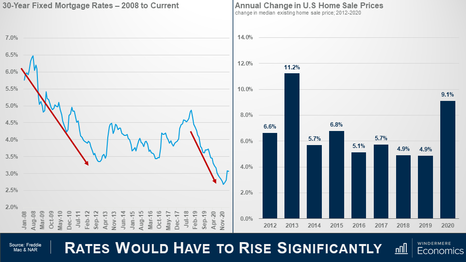
So, moving forward in time, you can see that rates dropped again as the financial crisis was taking hold and the country was entering a recession and rates dropped even more staring in 2019 as the Fed became concerned about inflation, slowing global growth, and trade wars.
And they offered further supported to the housing market at the onset of the pandemic by aggressively buy bonds which effectively lowered mortgage rates even further.
So far, you may be thinking, “well, its clearly the same as last time”, but I’m afraid that you’d be wrong.
You see, although sale prices surged in 2013 – realistically because home prices over corrected on the downside following the bubble – average annual price growth since 2013 has been slower we saw pre-bubble.
The median sale price rose by an average annual rate of 7.6% between 2000 and 2005, but between 2014 and 2020, the pace of appreciation was a full 1.5 percentage points lower.
I am going to talk more about mortgages shortly, but it’s important to touch on another significant difference between the 2000’s and now and that’s housing supply.
As you can see here, starting in 2001, inventory levels rose and peaked just as the bubble was about to burst. Why? Well, do you remember me telling you about the surge in unique mortgage products – specifically ARM’s?
1 in 10 borrowers in ‘05 and ‘06 took out “option ARM” loans and one-third of ARMs originated between 2004 and 2006 had “teaser” rates below 4%. Therefore, we started to see people try to sell before the rate reset and this led to the growth in listings. But how does that compare to what we’ve seen over the past several years?
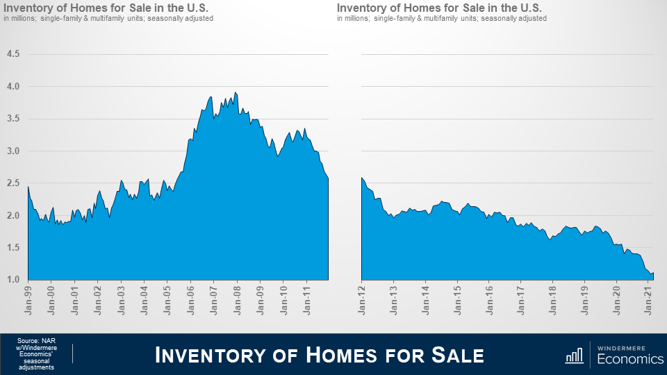
The number of homes for sale has been sliding since the spring of 2011 and is currently at the lowest levels since data on total US listings started to be gathered back in 1999. Ultimately, the basic economic laws of supply and demand are working today. Prices rise on scarcity of product and lower cost of financing. Both of which we see here.
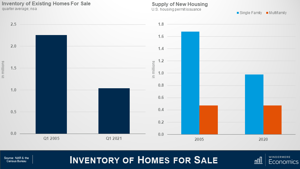
This shows the average number of existing homes that were for sale in the spring of 2005 – a date I chose as it was before the mortgage ARMS’s started to reset – and this spring.
Clearly a significant disparity. Now some of you may say that its lower because of the pandemic, but even if I were to use the spring of 2020 as a comparison – before the pandemic took hold – listings would still be 36% lower than in 2005.
But new demand can be met by building more new homes. Almost 1.7 million single family permits were issued in 2005 when the market was booming, but fewer than 1 million single family permits were issued last year.
The multifamily side is a little more complex as we cannot distinguish between condominiums and apartments, but I would suggest that although the number is pretty close to identical, the difference is that new multifamily permits last year were focused on the apartment world, whereas they were mainly condominiums back in 2005.
With low levels of existing and new homes for sale today, prices have risen significantly, but the difference I see is that during the pre-bubble years prices were climbing more as a function of speculation rather than real demand as there were significantly more homes available back then.
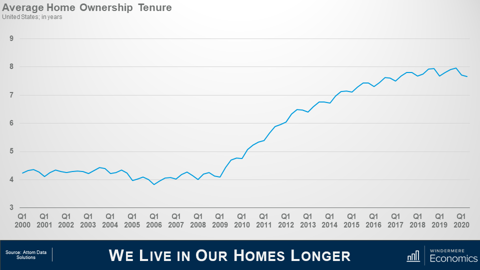
And another reason why housing supply has been so weak is that we simply aren’t moving as often as we used to.
Speculation drove home buyers to move on average every 4 or so years in the early to mid 2000’s; but look at more recent years. Mobility has dropped and we now live in our homes for twice as long as we used to and this limits housing turnover which, with the relatively low levels of new construction we just discussed, also puts upward pricing pressure on housing as supply levels stay low.
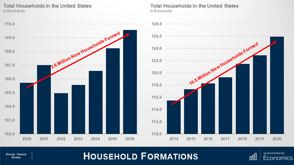
On the demand side of the equation, Census data shows that 3.8 million new households were formed in the United States between 2000 2006 which is a decent enough number.
But between 2014 and 2020, we added 10.5 million new households.
Now of course not all newly formed households become home buyers. I totally understand that. But we know that the long-term average homeownership rates in America is around 65% so it’s easy to extrapolate the numbers and conclude that demand for ownership housing continues to far exceed supply.
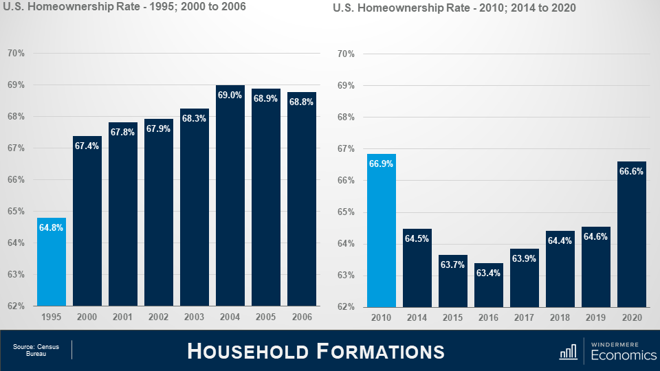
And talking about the ownership rate, some think that it is rising too fast – and that is proof that a speculative bubble is in place but look at this.
The pre-bubble period saw the ownership rate start to skyrocket, ultimately hitting an all-time high in 2004.
The rate was still elevated in 2010 and did not reach a bottom until 2016, but even though it has risen since, it remains well below the level seen in ’04.
Oh! If you are wondering about the 2020 spike, well I would take that with a pinch of salt. I say this as the Census Bureau survey in the first two quarters of last year were significantly affected by COVID-19 and I believe that the ownership rate was overestimated.
In fact, data for the first quarter of this year shows the ownership rate at 65.6% which is more realistic.
So, I think this clearly shows that although we continue to add households, we have not seen a speculatively driven spike in the ownership rate similar to the one we saw as the bubble was forming.
Well so far, we’ve looked at the supply of homes and how that has impacted the increase in housing prices; how demand continues to rise as more new households are formed; and we also covered the impact mortgage rates has had on home prices.
The Financing Side of the Equation
I promised you earlier that we would be returning to the financing side of the equation, because it is clear to me that it was the chief culprit behind the housing bubble.
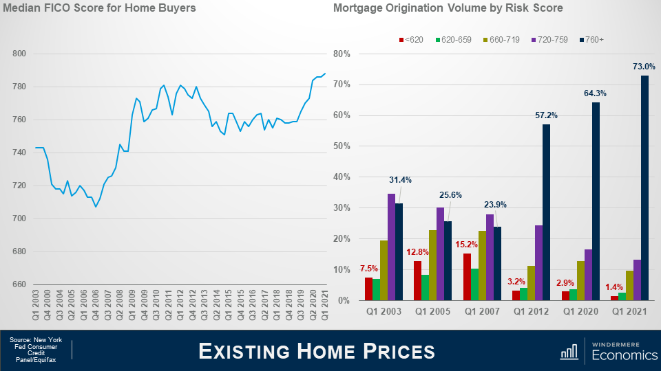
This chart shows the median credit – or FICO score – for home buyers approved for a loan and you can see the significant drop in credit quality that occurred in the early to mid-200’s.
But look at where we are today. The median credit score is now 788, and when we look at the numbers in a little more detail it’s even more remarkable as by early 2007 the riskiest borrowers – those with credit ratings below 620 – were borrowing 15% of all funds used to buy homes while prime borrowers we’re just below 24%.
But, again, look where we are today. The sub-prime share of mortgage borrowing has shrunk to just 1.4% while prime borrowers are now at a very solid 73%.
The bottom line is that credit quality is remarkably high, and not at all like the pre-bubble period.
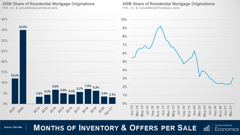
Earlier we discussed that between 2001 and 2007, mortgage debt doubled and much of this growth came via risky mortgage products – many of which were adjustable-rate mortgages that offered the buyer significantly lower monthly payments.
ARM’s accounted for 35% of all mortgage borrowing in 2004 but the current share is far lower, which should quell any concerns that there might be a wave of ARM’s resetting that could impact the market.
And as you can see here, the share has dropped precipitously, but has levelled off over the past few months before rising modestly in March.
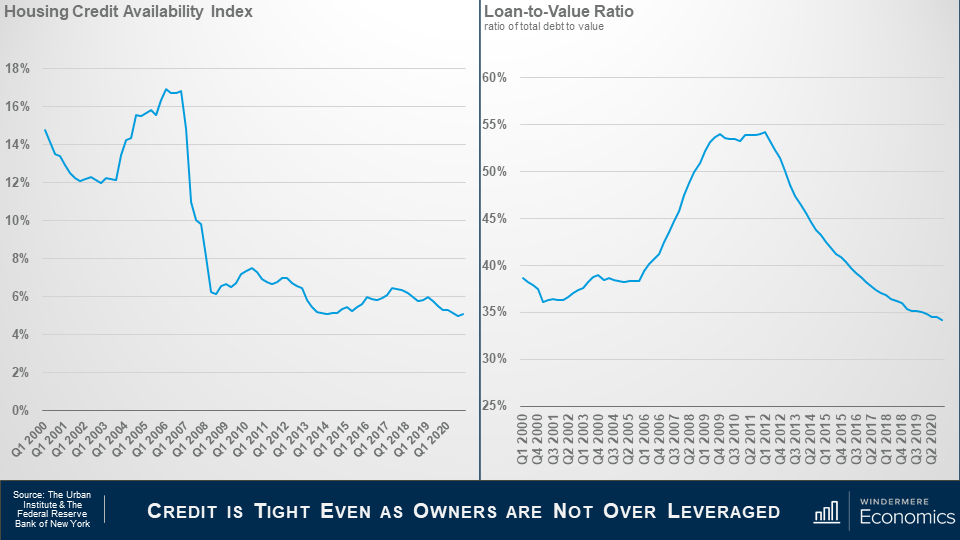
This is data from the Urban Institute that I use regularly. It’s their Housing Credit Availability Index (HCAI) and it calculates the percentage of owner-occupied home purchase loans that are likely to default—that is, go unpaid for more than 90 days past their due date, and I like this as their methodology also weights for the likelihood of economic downturns as well.
A lower HCAI indicates that lenders are unwilling to tolerate defaults and are imposing tighter lending standards, therefore making it harder to get a loan while a higher percentage suggests that lenders are willing to tolerate defaults and are taking more risks by making it easier to get a loan.
Lenders were all good taking risks in the bubble days but are certainly looking at things very differently now.
The bottom line is that even if the current default risk doubled, it would still be well within the pre-crisis standard of 12.5% that was seen between 2001 and 2003.
And this chart shows loan to value ratios – as the bubble was forming the ratio went up as buyers were getting over leveraged but look where it is now. Well below pre-bubble levels.
Again, tight credit and significant equity puts us in a very different place than we were in the 2000’s.
My Forbearance Forecast
I am sharing forbearance data for one reason and it’s because some brokers have told me that they have clients who are thinking about waiting to buy as they believe that homes in forbearance will end up in foreclosure and the growth in supply could lead home prices to drop across the board, or at the very least allow them to pick up a home on the cheap.
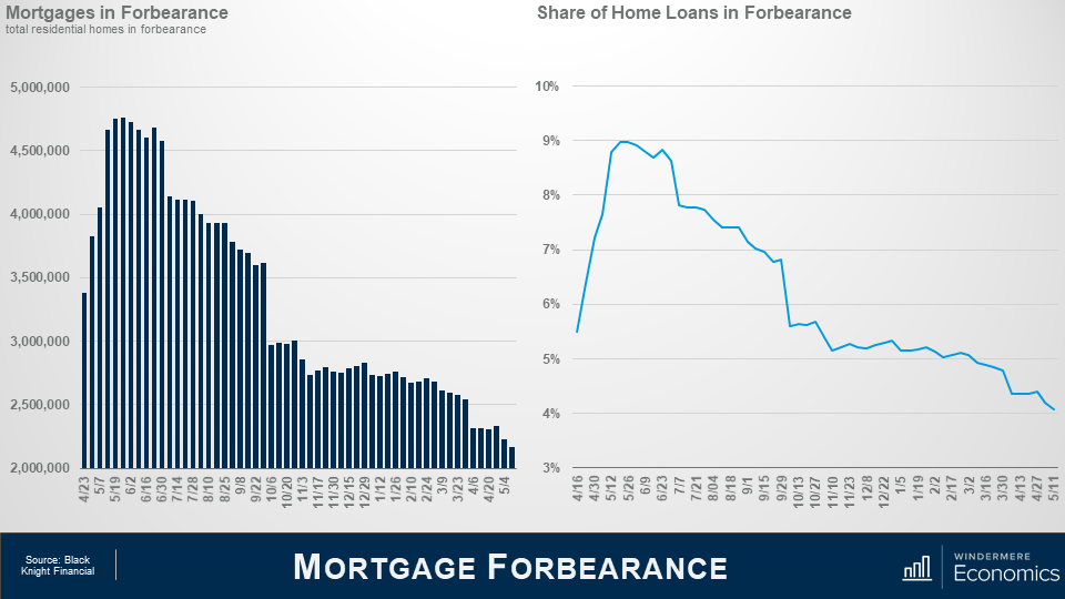
But as you can see, the number of homes currently in the program is down by over half from its May 2020 peak – and that equates to 2.6 million homes.
In fact, even if all the homes still in the program did actually end up in foreclosure, it would still only represent a fraction of the nearly 10 million homes that were foreclosed on due to the housing bubble bursting.
And when we look at the share of total homes in forbearance, it peaked at just over 9% but is now knocking in the door of 4% and with over 250,000 more homes about to hit the end of their forbearance period, I anticipate that the numbers will drop further later month.
So why am I not worried that a large share of these homes will be foreclosed on? This is why.
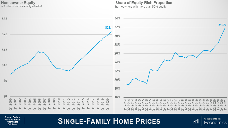
In the first quarter of this year homeowners were sat on over $21 trillion in equity – a truly massive figure.
You can see the buildup of equity as the housing bubble was forming and then it contracted through the housing crisis; however, since 2012 home equity levels have more than doubled.
My friends over at Attom Data Solutions estimate that, in the first quarter of this year, almost one in three homeowners in America had more than 50% equity in their homes – that’s almost 18 million homeowners.
And this tells me that a lot of owners in forbearance who just cannot get back on the right path still have the option to sell their homes in order to keep the equity that they have – after the bank is made whole, of course – rather than go through the foreclosure process.
And further support comes from the folks over at Core Logics who recently put out a paper suggesting that about 42% of all owners in the forbearance program bought their home before 2012 and they have, unsurprisingly, built up a sizeable chunk of equity in their homes, with median equity – even after they cover any missed payments – of almost $100,000.
Of course, it’s reasonable to say that this may all sound good, but what about owners who didn’t buy a long time ago and therefore have less equity.
Well, their data shows that 43% of owners in forbearance bought between 2013 and 2018 and they too have benefitted from prices rising and have an average of more than $87,000 in equity – again after accounting for missed payments.
And even the newest owners – those who purchased their home in 2019 or later – and they represent 15% of all homes in forbearance – well they still have an average of over $65,000 in equity.
The bottom line is that, in broad terms, a typical homeowner in forbearance could – with relative ease – cover the costs of selling a home and still have some equity left over.
Will foreclosures rise this year – yes, they will – but given all the facts I have just shared with you, I see it as being more of a trickle than a flood.
Well, there you have it.
In Conclusion
As far as I can see, all the data shows that we are in a very different place today than we were in the 2000’s and I find it highly unlikely that we will see a repeat of the events we saw back then.
Down payments are higher; credit quality is higher; and demographic demand for ownership housing remains robust and – quite likely will only grow as the nation’s Millennials continue to reach prime home buying. Remember that 9.6 million of them will be turning 30 over the next 2 years alone.
But, as I said in my opening comments, the pace of price growth that we’ve seen over the last year or so is clearly unsustainable and must, at some point start to slow, if only to allow incomes to catch up.
In fact, I am already seeing some tentative signs of this with the percentage growth in list prices starting to soften in several markets across the country which should start to ease the pace of sale price appreciation.
But I am afraid that I just don’t see a national downturn in home values occurring – unless banks decide to significantly loosen their underwriting criteria, but I find that very hard to believe.
Thank you for sticking with me during this rather long video. I do hope that you found it of some interest.
As always, if you have any questions or comments about today’s topic, please feel free to reach out. I would love to hear from you.
In the meantime, thank you again for watching, stay safe out there, and I look forward to visiting with you again, next month.
On this month’s episode of “Monday with Matthew,” Windermere’s Chief Economist Matthew Gardner digs into mortgage rates, new construction, and condominium sales.
Hello there and welcome to the April edition of Mondays with Matthew. I’m Windermere Real Estate’s Chief Economist, Matthew Gardner
There were a lot of rich, housing-related datasets released this month so let’s get going.
And first up, I want to look at mortgage applications.
Source: MBA
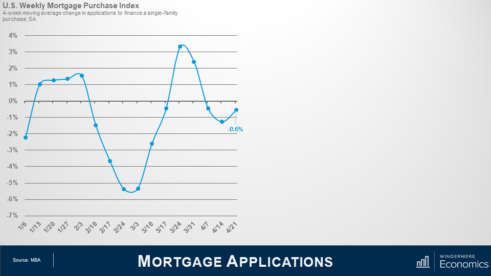
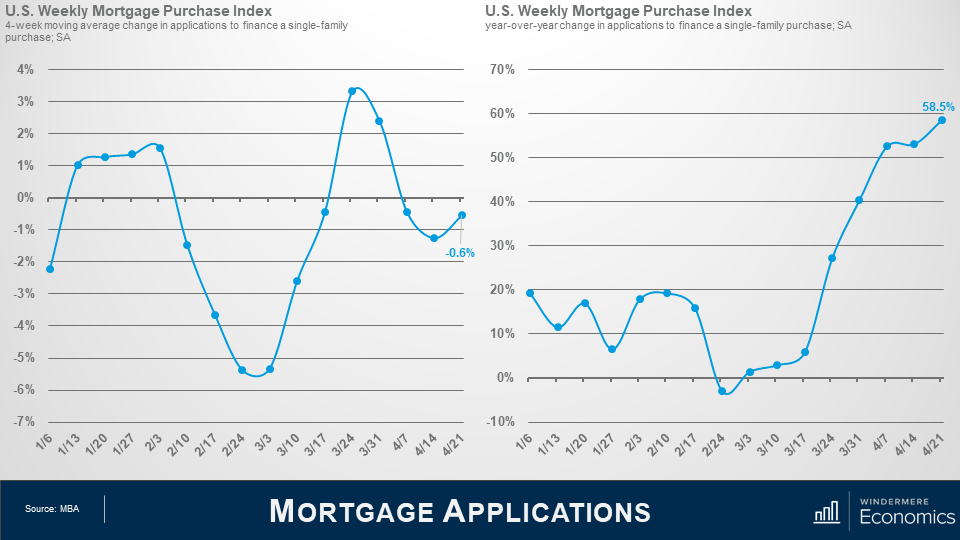
You may remember last month we discussed what was going on with mortgage rates as they had started to trend higher beginning in the New Year. Well, as rates rose, you can see here that mortgage applications slowed before picking back up in at the end of February, which was interesting as rates were still rising at that time.
And for those who find it curious that applications picked up even as rates were rising, well it was partly because buyers started to believe that rates would not be headed back down, and they wanted to get locked in for fear that they would continue trending higher.
Now, this pattern did reverse at the end of March as rising rates started to take a toll on would be buyers and affordability issues started to come more into play, but as mortgage rates pulled back in April, applications picked up again – albeit modestly.
Source: MBA
But when we take a look at the data on a year-over-year basis. Well, WOW!
Applications were up by over 58%! But remember what happened in March of last year? Who can forget….?
And its therefore really not surprising to see this kind of spike, but, I would caution you all that almost any dataset that compares current numbers to those seen a year ago – well, they are likely to paint far too rosy a picture, and one that is removed from reality.
Something to be aware of.
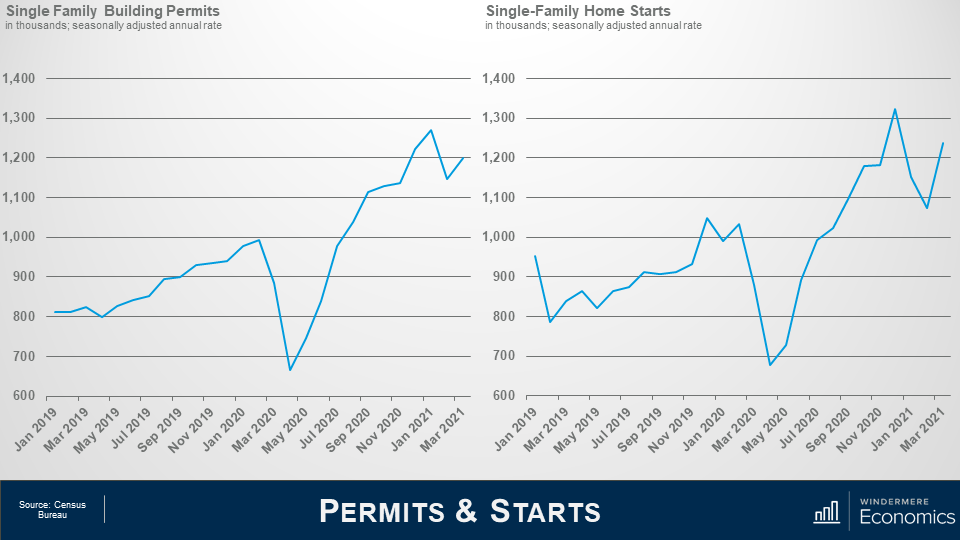
Next up, we got several datasets regarding the new home market March and we will start off with permits and starts.
Source: Census Bureau
Following the pullback in permit applications that was seen in February, builders were more optimistic in March with single family permits up by 4.6% on the month and 35.6% higher than a year ago – but don’t forget what we just said about year over year data!
Looking at housing starts – well they pulled back in January and February, but also saw a solid 15% monthly increase in March.
Interestingly, there was a massive spike in starts in the mid-west where they were up by 109% month-over-month, but they were actually down by over 12% out here in the west.
I would also let you know that the number of homes under construction rose by 1.6% versus February and this was particularly pleasing given that construction costs remain very elevated.
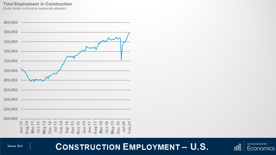
And it hasn’t just been material costs that have been hitting home builders, they have also seen significant pressures with labor costs and here’s why…
Source: BLS
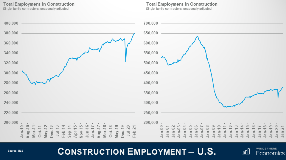
This chart shows how many people are employed in the construction of single-family homes and, at face value, it looks pretty good with constant growth seen since 2012 – of course, ignoring the impact of the pandemic but….
Source: BLS
Looking at a longer timeline, it doesn’t paint as good a picture. At its peak in 2006, there were almost 650,000 people employed building homes, but the number today is just 60% of that.
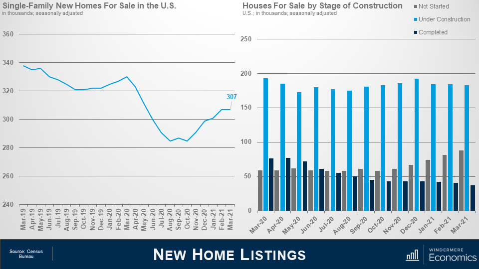
Of course, there are fewer homes being started today than there were back in those halcyon days but starts today aren’t 40% lower, so the job market remains tight. In fact, there are over 260,000 job openings in the construction sector. Of course, not all of them are for the single-family construction market, but we do know that builder’s cost of labor is rising and that, in concert with higher land and material costs continue to impact builder’s ability to bring homes to market that are relatively affordable as the increase in costs is transferred directly into the price that a home must sell for and that brings me to data on new home listings, sales and prices in March.
Source: Census Bureau
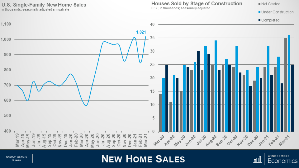
Even with new housing permits and starts rising significantly the seasonally adjusted estimate of new houses for sale at the end of March was 307,000. This represents a supply of 3.6 months at the current sales rate.
The number of new homes for sale was down by 7% from a year ago, but I do expect that the increase in permits and starts bodes well for this arena, and I do expect to see more listings come online over time.
If you look at the chart to the right, you will notice that the number of homes for sale that have yet to be started continues to rise. This is because builders want some certainty that the home will be sold, and it’s, therefore, easier to sell before you build it.
Source: Census Bureau
And when we look at sales, well they rise by 20.7% in March to an annual rate of over 1 million units and clearly rebounded from the previous month when we saw a massive drop as severe winter storms wreaked havoc across much of the country.
Interestingly, you will see that as many homes sold that hadn’t yet started as were under construction. Clearly, demand is robust to the degree that buyers willing to commit to buying a home that hasn’t yet been built.
The median new home sale price came in at $330,800 – that’s down by 4.4% on the month but 0.8% higher than a year ago.
Source: NAR
OK – now we have covered the new home market, let’s take a look at how the resale market fared in March.
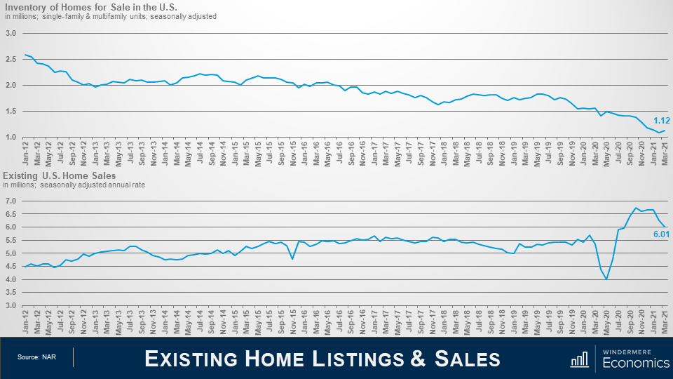
The number of homes for sale remains at almost historically low levels with marginally more than 1 million units on the market. Now there maybe some of you out there who say that is inaccurate as NAR is reporting 1.07 million homes for sale, and you’d be absolutely correct. But I have adjusted the data to account for seasonality, so it is slightly different.
Anyway, with such limited choice across the country, it wasn’t a surprise to see sales pulling back, with the total number of closings running at an annual rate of 6 million units – that’s down by 3.7% month over month, and down by 12.3% when compared to March of 2020.
Am I worried about this? No, I am not. Why? Well, as I just mentioned, just look at the inventory numbers. With little choice, it’s not at all surprising to see sales pull back but I would add that the market still hit 6 million transactions and that was in the face of the increase in mortgage rates that we saw last month so, to tell you the truth, I was actually a little surprised to see that the number held above that 6 million level.
Source: NAR
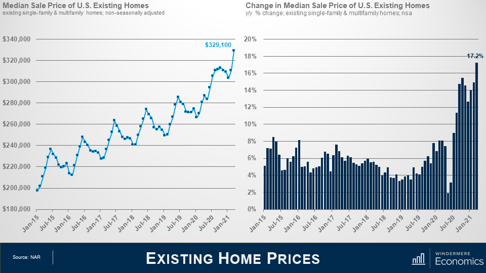
But even as sales pulled back a little, prices didn’t, and more records were broken with the median sale price hitting an all-time high, and year-over-year price growth above 17% was another record shattered.
Source: NAR
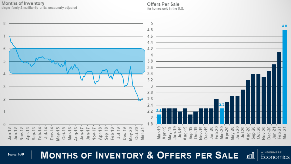
And if you need further proof that there is little to be concerned about when it comes to sales pulling back, you only need to look at these charts. Low supply, but still very robust demand has months of supply at levels that indicate a highly unbalanced market. Nationally, I like to see somewhere between 4 and 6 months of supply, not 2.1…
But look at the right. For every offer accepted in March, there were 3.8 additional offers, and I would also tell you that the average length of time it took to sell a home in March was just 18 days and that’s down by one day from February but down by eleven days when compared to a year ago.
Surely if demand was waning, wouldn’t the number of offers be going down, and days on market going up?
Source: NAR with Windermere Economics seasonal adjustments
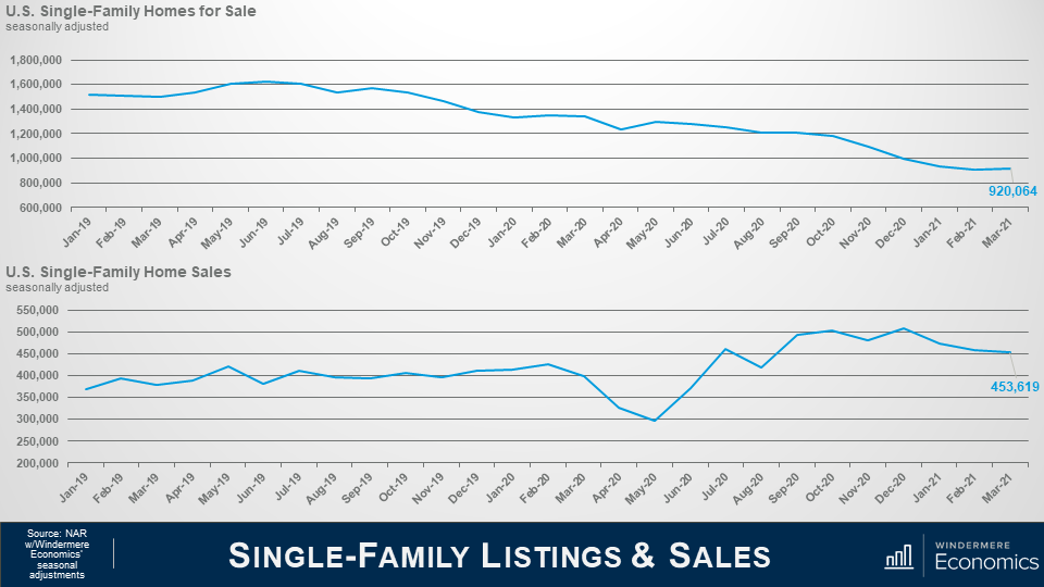
And when we separate out the single-family market, you can see that listings notched very slightly higher – up by 1.2%, but the level is still close to an all-time low with listings down by over 31% year over year.
As far as sales are concerned, well they also pulled back a little and were down by 1.3% versus February but were 14% higher year over year.
Source: NAR
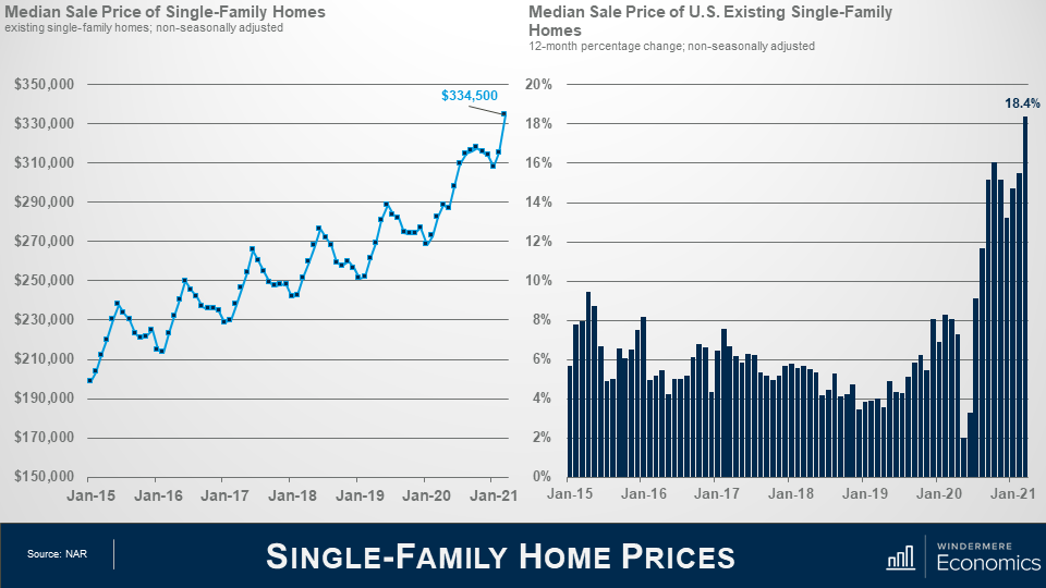
And as we discussed earlier, even with lower sales activity, sale prices are still rising at a very rapid pace and are now over 18% higher than seen a year ago and a remarkable 6.2% higher than seen in February.
The median price also broke above $330,000 for the first time.
Source: NAR with Windermere Economics Seasonal Adjustments
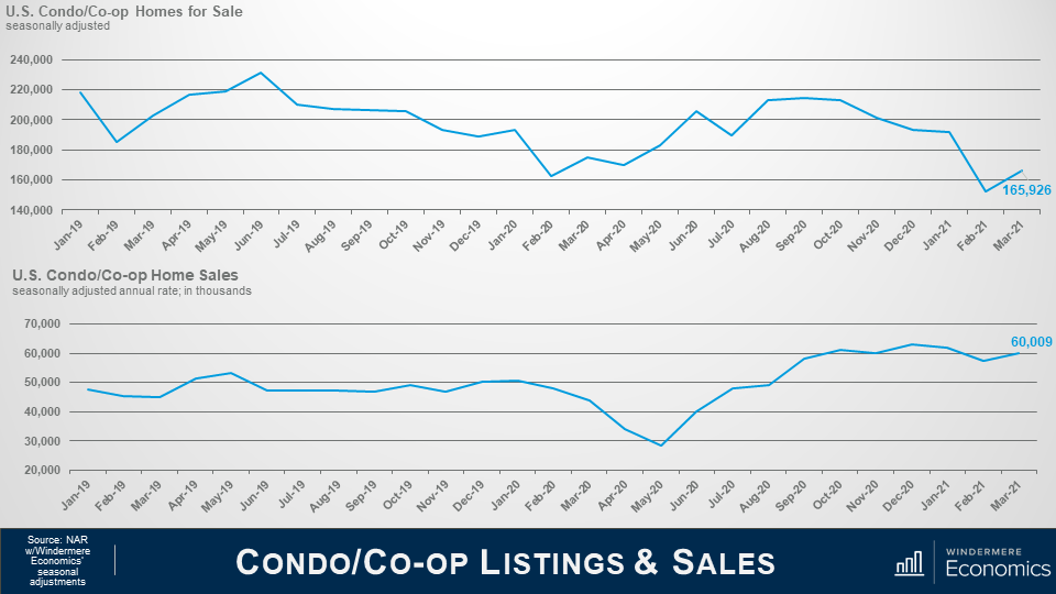
Moving on to the condominium market, we saw listings rise as the pandemic took hold, and there were concerns back then that we were at the start of a systemic increase in listings with people fleeing cities over fears of COVID-19, as well as the ability to work remotely, but the increase soon wore off, even if it rise by 9% in March when compared to February, but there were 5.1% fewer listings than seen a year ago.
But on the sales front – and with listings rising – we saw demand for those homes with sales up by 5% versus February and 36.4% higher than seen in March of 2020.
Source: NAR
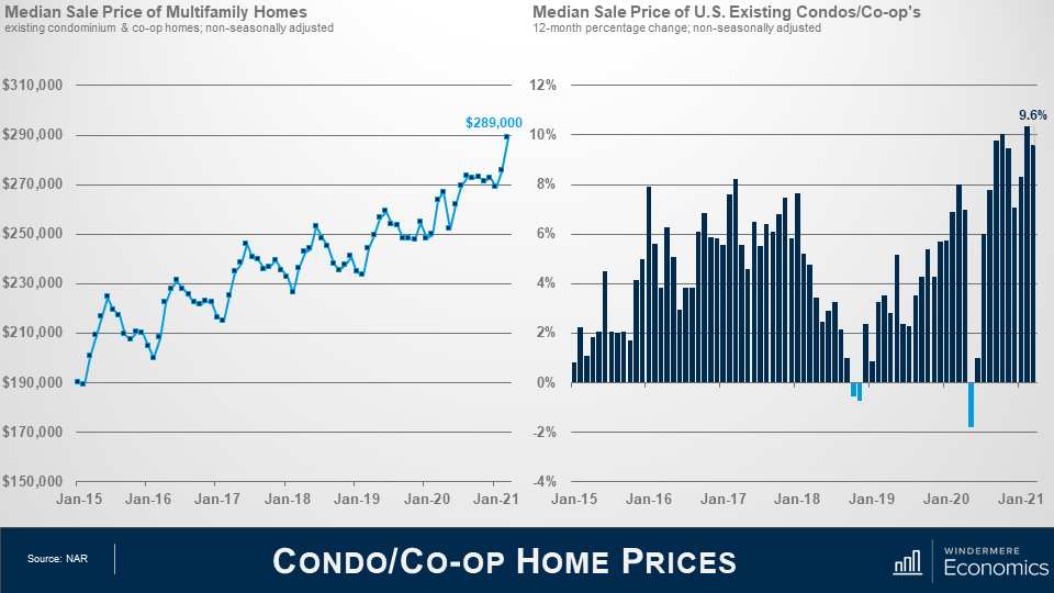
In a similar fashion to single-family prices, sale prices for condominium units saw a spike in price in March and were up by 4.9% versus February and almost 10% higher than seen a year ago.
Although you will see that annual sale price growth did turn negative last May – due to COVID – it is actually rare to see this. We did see a tiny drop back in 2018 but you will likely remember that mortgage rates were rising then and knocking on the door of 5%.
Anyway, since last May, sale prices have picked back up very nicely and worries of any significant drop in condo prices appear to be overblown.
As far as the ownership market is concerned, I am far less worried that mortgage rates have been ticking higher than I am that there are just not enough homes for sale to meet demand.
We had seen some growth in the new construction arena – and that took just a tiny bit of heat off the resale arena – but demand continues to exceed supply, and that is pushing prices higher and affordability issues have already started to appear in several markets across the country.
At some point, we will see price growth slow, but I think that it will be far more to do with affordability limitations than it will rising mortgage rates.
So, there you have it. My thoughts on the housing market in March.
As always, if you have any questions or comments about the numbers, we have looked at today, feel free to reach out. I would love to hear from you.
In the meantime, thank you for watching, stay safe out there, and I look forward to visiting with you again, next month.


 Facebook
 X
X
 Pinterest
 Copy Link