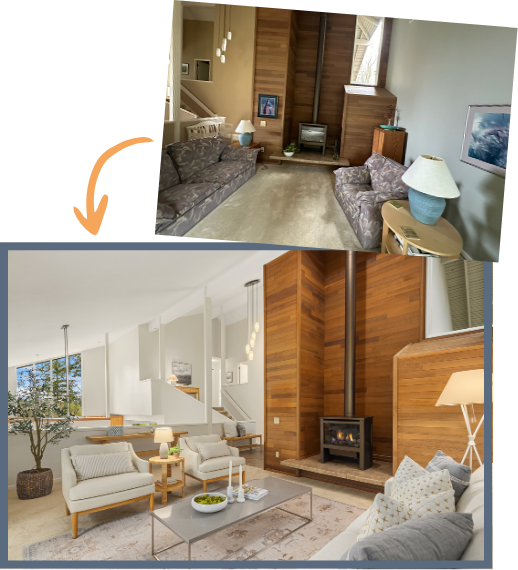
real estate November 29, 2021

What Does Contingent Mean in Real Estate?

Once in a while, there’s that one kind of house that you’re just head over heels about. Funny enough, you may not even realize that you need a house until you come across your dream home. Once you set your mind on buying it, you may want to consider contingencies to protect yourself financially. Whether you’re acquiring a home to live in or it’s an investment property, contingencies can help you evade a costly mistake.

Contingencies tend to give you higher authority over the home-buying process with an opt-out clause in case things don’t go as expected.  Buying a house involves getting into a legally binding contract with the seller. With a profound understanding of contingencies, you can begin the home-buying negotiations with greater confidence.

What Does Contingent Mean in Real Estate?

In a real estate contract, contingent means that a buyer has initiated a purchase offer and the seller has accepted the offer. Notwithstanding, the contract is conditional upon some things occurring, and the deal’s closing will not occur until those things have happened. If the set things fail to occur within the stated time, the deal is canceled without any legal consequences. Any contingency ought to be clearly stated so that both the buyer and seller have a better understanding of the terms.

Here are a few examples of the most common contingencies for buyers:

1.    Inspection Contingency

A home inspection contingency means that if the inspector finds problems with the home during the inspection, you can walk away from the contingent offer as a buyer. The inspector typically checks both inside and outside the home for any signs of damage or wear and tear. The inspection takes place within days of creating a contingent offer so that you can decide if to continue or walk away from the sale.

2.    Mortgage Contingency

A mortgage contingency is a clause written into a property sale agreement that can terminate the sale if certain conditions aren’t met. This clause offers protection to both the buyer and the seller in case the buyer doesn’t secure mortgage financing. It also specifies when an official approval for a mortgage is to be made. If any party backs out before the mortgage money is secured, then there are no penalties.

3.    Appraisal Contingency

When applying for a loan, the lender may decide to hire a third-party appraiser to assess the property’s fair market value to make sure that their investment in you doesn’t go to waste. The appraisal contingency makes sure that you’re safe if the property’s sale price is a bit higher than the property’s appraised value. The contingency includes dates by which you ought to alert the seller in case of any inconsistencies between the appraisal value and the selling price, giving them an opportunity to negotiate the price.

4.    Home Sale Contingency

This means that buying a new home is contingent on your ability to sell your current home. The contingency states that if you have sold your home by a certain date, you can buy the new home, and the deal will continue. If you fail to sell by that date, the deal is either extended or canceled by the seller.

A seller can also include some clauses to protect themselves, and the most common is a “kick-out” clause.

What’s A Kick-Out Clause?

A kick-out clause seeks to protect the seller by giving them a right to continue marketing their home if they receive an offer with contingencies that need to be met. If the buyer delays the process because they are unable to sell their home, the seller can put this clause into effect. The clause gives the seller a chance to switch to a buyer capable of completing the sale.

Final Thoughts

Whether for the buyer or seller, contingencies in real estate can have a huge impact on the sale. As a buyer, they can give you a lot of protection in the home buying process. And having a better understanding of the most prevalent contingencies and what they stand for gives you a rising awareness of what to leave out and what to include.

Ready to learn the ins and outs of contingencies in real estate? Let’s connect to chat about your real estate questions or needs.

bellevuemarket trendspreparing your home November 7, 2021

Who Can Sell Your House Quickly and for Top Dollar?

When it comes to selling your home, you want to see the best possible results of the sale. After all, you can only sell it once. When you ask yourself the best possible result of the home sale, naturally, your first thought is to sell for top dollar. You want a realtor who can make your house shine, show off its best features, and find buyers who will bid well over the market value. Of course, you also don’t want the sale to take forever, delayed by renovations or losing value sitting on the market for months.

To see the best results of a home sale, you need a strong real estate partner. Your agent and brokerage are an important part of the home-selling team and their expertise plays an important role in both optimizing your home’s appeal on the market and swiftly finding a buyer who is ready to commit to a top-dollar price.

So how do you find the ideal real estate agent to work closely with you, sell your house quickly, and get the best price for the property value? Here’s how you can get started:

A Real Estate Agent Who Understands You

Selling a home is a team effort, so you will need someone you can talk to easily. You need someone who you understand when they explain the home selling process and someone who understands you when you explain your priorities and budget. An agent who doesn’t listen makes decisions without checking with you, or who doesn’t speak clearly with you isn’t a good partner, so it’s okay to interview a few agents before you find the right one that “clicks”.

Communication is key, so build a rapport quickly. Share your ideas about selling and listen to your agent’s advice so you are both on the same page. Then decide what to do together, using their expertise and your situation as guiding points.

The Windermere Real Estate Boost

Home sellers planning for pre-sale renovations with a Windermere agent (like myself) also gain the benefit of the Windermere network and the Windermere Ready experience. Windermere is the largest residential real estate firm in Puget Sound and specializes in luxury real estate with a dedicated network of home service and real estate professionals available to tap at any time.

Windermere Ready is a no-interest home improvement loan and access to a network of awesome home services providers that can be accessed to make any pre-sale updates and staging to sell your home. If you want or need to make a renovation before selling to increase the final sale price, you gain access to trustworthy teams, guided improvements, and the work is covered when your home sells at a higher market value.

Knowing Your Local Buyers and Housing Market

Of course, good decor and rapport aren’t all that sell a house. If you really want to sell for top dollar, it’s important to motivate your buyers. And to do that, you need an agent who knows the local market. Who is looking for homes in your neighborhood, and what do they want to see in a house? In the greater Seattle area, the local draw could be anything from boho chic to glass-tower modern. Your area might be drawing families, retirees, vacation homebuyers, or solo professionals focused on a now-hybrid home/work career. Should the walls be blue-gray or honey-brown? Should you stage in stainless steel or woven-and-wicker?

The right staging is whatever inspires your local buyers to fall in love with the house, to suddenly imagine themselves living there, and begin writing their future before the tour is over. A real estate agent who knows the area and the buyers can help you inspire not eager buyers, but those inspired to bid well above listing to ensure you choose their bid first.

Closing Quickly on the Best Offer

Last and certainly not least, a great real estate partner will help you close swiftly on the best bid. When a top bidder arrives or the bidding flurry settles into the highest verified bid, your agent will help you choose, escrow, negotiate, and close without wasting time. Homes lose value as they sit on the market, and they can take ‘vacancy’ damages if closing drags on. A great real estate agent will ensure your home is listed, sold at a high value, and closed before it has time to get dusty inside, much less cool on the market.

Do you need to sell a home quickly and for the best possible price? I know exactly where you are standing, I’ve been there myself. With over three decades of listening to my clients before we make a plan, you can know that I will help you make all the right decisions for your property, situation, budget, and timeline. Whether you’re selling a house in a rush or just want to sell for top dollar, let’s connect to chat about your goals. We’ll get your home sold quickly and for top-dollar together.

bellevuesomerset October 14, 2021

Somerset Home Exudes Sophistication, Elegance, and Contemporary Class

Nestled on one of the most exclusive streets in Somerset sits this sophisticated & elegant NW Contemporary home featuring expansive views, total privacy & special finishes.

4630 139th Ave SE, Bellevue WA 98006

Offered at: $2,680,000

This 4 bedroom, 4 bath, 4,310 square foot Somerset home has exquisite finishes throughout. Cherrywood hardwood floors that span throughout the main spaces in the home are beautifully maintained. A chef’s kitchen that is suited for any level of cook and perfect for entertaining. No expense was spared, with high-end appliances to support all of your cooking needs. The kitchen is accompanied by a wet bar that is perfect for an end-of-day beverage or entertaining.

The entire home offers a unique and stunning experience through the floor to soaring ceilings which offers an open and expansive feel throughout. Walls of glass bring a one-of-a-kind view of the city, lake, and mountains, a beautiful and perfect oasis to retreat to right from the comforts of your home.

The master suite is generously spaced and features a beautiful fireplace and floor-to-ceiling windows with territorial views. The suite is accompanied by a high-end en-suite with no area left untouched. A stunning soaker tub with beautiful views, shower complete with a rain shower, and custom design.

Located at the top of Somerset Hill, this home is close to Somerset Elementary and part of a wonderful and highly sought-after community. Ready for a unique, stunning, and turn-key home? You’ve found it.

An open house will be held October 15-17th.

Friday: 3:30-5:30pm

Saturday: 1:00-3:00pm

Sunday: 12:00-2:00pm

View listing here.


bellevuelistingsmarket trendssomerset October 9, 2021

You Can Sell Your Home As Is; With the RIGHT Real Estate Agent

Inside Scoop: You absolutely can sell a home as-is, without renovations. You can even sell a home without even lifting a finger! It all matters who you list with.

How much can you make with your home sale? How much will it take to renovate your home to get its best price on the market? As it turns out, all that renovation often isn’t necessary. Many homeowners can get a great price after just a little cleaning and staging – provided you’re working with a real estate agent who knows their stuff. It’s rarely mentioned, but who you list with matters. There’s a difference between a weekend agent handling your sale in their own free time and someone who’s been dedicated to Seattle Eastside area real estate for over thirty years of hands-on market experience. Someone who lives, works, and breathes the area and knows exactly what it will take to get you the highest dollar for your home, and quickest sale.

The right real estate agent will see the potential for your home, know the neighborhood values, and help you connect with motivated buyers who want to give you a great price. I recently listed a home in SE Bellevue which sold as-is at the second-highest price per square foot in the Somerset neighborhood. The only home value that topped our recent sale had been recently remodeled while our home sold from the original owners without a single remodel or update.

The Home’s First Sale, Sold As-Is by the Original Homeowners

The challenge was set. When the SE Bellevue homeowners came to us, they had two goals. First, they wanted to sell the home for a good price and, second, they didn’t want to do any renovations. The home was to sell as-is, without renovations or updates after decades of being lived in by the original owners!

Usually, real estate agents lean on minor home renovations to make a decades-old home competitive on the modern housing market. In many cases, the increase in selling price only barely offsets the value of the renovations. Selling at a good price without renovations could easily result in more profit for the seller. We could see why our seller wanted “no renovations”, so that’s what we did.

We’re proud to say that our efforts resulted in a sale over $400K above the listing price within a week on the market.

How We Prepared for a Fantastic As-Is Sale

So how do we transform an as-is home into a highly competitive listing? My team got to work with a quick and effective strategy to make the as-is home feel welcoming and inspiring to local home buyers. We first removed personal items then cleaned, staged, and professionally photographed the home. The photographs and our now-intimate knowledge of the home helped us create a powerful listing that quickly produced a cash buyer and a one-week close.

Clearing and Deep-Cleaning

The first step for any home sale is deep cleaning. We scrub the grout, steam-clean the carpets, washed the windows, and polished the fixtures. We got this home as close to like-new as possible on the interior and gave the exterior a quick touch-up to spotlight the gorgeous architecture and mature landscape design. And boy did it shine!

Staging the Home

Stating is an artistic way to arrange sample furniture and decorations inside a home. Staging gives buyers a clear idea of how big rooms are, what they are for. Staging uses interior design elements to show off the best features and design potential of each room. We aim for each room to inspire buyers to imagine the life they could live in the staged home.

We staged this Bellevue Somerset home with a cozy contemporary style popular in the area. Its sunset views and multi-layer design made it easy to use natural light a warm color scheme to show the home’s best side.

Professional Photograph Tour

Professional photography is a must. Bridging in a professional ensures every angle is perfect and the photos will capture the essence of the home, not just the images. A professional photographer can design a photo tour that feels like walking through the home, and they know how to catch the best features in every angled shot while giving buyers a real idea of the space.

The Final Result: An Incredible As-Is Sale in Bellevue

After listing the home with a glowingly detailed description and professional photographs, we rapidly received nine sure bids from local buyers and closed within a week with a cash-sale more than $400,000 above the original listing price.

This home sold for such a great value because we knew the neighborhood, the buyers, and we brought the home’s potential to the surface. Buyers of as-is homes are often ready to improve the home independently and don’t need sellers to do a thing. A great opportunity for buyers to get into a great home in a great neighborhood and the sellers to pocket some great money! From the way we stage to the way we list; I leverage my 30 years of industry experience living and working in the area to help your as-is sale connect strongly with local buyers.

Can you sell your home as-is and still get a great selling price? Absolutely. It all depends on your local market and partnering with a truly effective real estate agent who knows your market like the back of their hand. If you are selling in the Seattle and Bellevue area and don’t want to renovate, my team can help turn your sale into an as-is success story. Let’s connect to talk about your plans for your home, whether it be selling today, or setting up a plan for the future.

real estate September 27, 2021

Housing and Economic Update from Matthew Gardner

This video is the latest in our Monday with Matthew series with Windermere Chief Economist Matthew Gardner. Each month, he analyzes the most up-to-date U.S. housing data to keep you well-informed about what’s going on in the real estate market.  

Hello there!  I’m Windermere Real Estate’s Chief Economist, Matthew Gardner, and welcome to the latest episode of Mondays with Matthew.

Today we are going to take a look at the latest Home Purchase Sentiment Index survey that was just put out by Fannie Mae. And for those of you who may not be familiar with this survey, it’s actually pretty important and one that I track closely as it’s the only national, monthly, survey of consumers that’s focused primarily on housing.

The survey shows the responses of 1,000 consumers across the country to roughly 100 survey questions on a wide range of housing-related topics. Now, don’t worry, we aren’t going to look at all 100 questions – just the ones that solicit consumers’ evaluations of housing market conditions and that also address topics related to their home purchase decisions.

Two line graphs side by side on a presentation slide titled “Home Purchase Sentiment”. On the Left is a graph showing the U.S. Home Purchase Sentiment Index Index Level from January 2021 to August 2021. From January 2021 to July 2019, there’s a slow increase from just above 65 to a peak just under 95. In May 2020 however, there’s a sharp valley that dips between 60 and 65. On the right shows the last three years where the Pandemic induced drop is more clear. The drop in sentiment index lasted roughly from February 2020 to August 2020, and has held relatively stable ever since, sitting between 75 and 83.

So, as you can see here, the overall index was trending higher pretty consistently until the pandemic happened which had massive, but temporary, impacts. And looking at the last 3-years, you can get a better idea as to the speed of the pandemic-induced drop – pretty remarkable.

Now, you will also see that the index recovered quite quickly; however, it fell again last fall as the pandemic was not going away at the speed many had hoped for – it rose again this spring but has been pulling back for the past few months but, that said, the August index level essentially matched the level seen in July.

Now let’s look at the questions that are used to create of the index number and how consumers responded.

Three lines on the same graph on a slide titled “Is it a Good Time to Buy?” which shows sentiment compared to those who think it’s a good time to buy and those who think it’s a bad time to buy. The graph’s x axis shows the percentage of respondents and the y axis shows dates from August 2018 to August 2021. The navy line indicates “Good Time to Buy” the light blue indicates bad time to buy, and the red indicates the net percentage good time to buy. The navy line sits above the other two lines for the most part, but it dips below and switches places with the light blue line in April 2021. The net share of those who say it’s a good time to buy jumped 7%, which is the first time it’s improved in the last four months.

When asked whether it was a good time to buy a home, the percentage who agreed with that statement rose from 28 to 32%, while the share who thought that it is a bad time to buy dropped from 66 to 63%. And, as a result, the net share of those who say it is a good time to buy jumped 7 points month over month, and it’s notable that this is the first time the net share number has improved in the past 4-months.

What I see here is that – although improving modestly, the general consensus is that it is not a good time to buy and that sentiment is being driven by two things: One – there are still not enough homes on the market, and two, rapidly rising prices are scaring some people.

Three lines on the same graph which shows seller sentiment. The presentation slide I titled “Is it a Good Time to Sell? The graph’s x-axis shows percentages from -60% to 100% and the y-axis shows thedates from August 2018 to August 2021. The navy line represents those who think it’s a good time to sell, the light blue line indicated those who think it’s a bad time to sell,and the red line indicates the net percentage of people who think it’s a good time to sell. The navy line is mostly on the higher end, sitting in the 65% range, until March 2020 when it flips with the light blue line. They switch back in August 2020 when they are 48% and 44%. The different grows in the last few months, landing at 54% net difference in August 21.

And when asked if they thought it was a good time to sell their homes it was interesting to see that share drop from 75 to 73% while the percentage who said that it’s a bad time to sell dropped 1 point to 19% and as a result, the net share of those who said it was a good time to sell pulled back by 1% but it still indicates that more owners think that it is a good time to sell than don’t.

Three lines on the ame grah to compare different sentiments about whether home prices will go up in the next 12 months. The slide is titled “Will Prices Go Up or Down Over the Next 12-Months” and the x-axis shows the percentage of respondents from -20% to 60%, and the y-axis shows the dates from August 2018 to August 2021. The navy lineindicates the respondents who thinkprices will go up, the light blue line shows the respondents who think prices will go down, and the red line shows the net percentage difference. In August 2021 net share of Americans who say home prices will go up dropped by 9 points – from 25%, down to 16%.

Looking now at the direction of home prices over the next 12-months, the percentage who think that home prices will rise fell from 46 to 40%, while the percentage who expected home prices to drop rose from 21 to 24%.

As a result, the net share of Americans who say home prices will go up dropped by 9 points – from 25%, down to 16%.

Although this may sound concerning, I should add that the share of respondents who thought that home prices will remain static over the next year rose from 27% to 31%.


Three lines on the same graph comparing the different expectations of people considering the mortgages rates of the next 12 months. The slide is titled “Mortgage Rate Expectations for the Next 12-Months” and the graph’s x-axis goes from -80% to 80% and the y axis shows dates from August 2018 to August 2021. The navy line indicates respondents who think mortgage rates will go up, the medium blue line shows those who think mortgage rates will go down, and the red lines shows the net percentage rates will go down. Most people think rates will go up. The net share of Americans who believed that mortgage rates will go down over the next 12 months rose by 5%

On the financing side, the share who think mortgage rates will rise over the next 12 months dropped from 57 to 53%, while the percentage who believed rates would be lower rose from 5% to 6% and, as a result, the net share of Americans who believed that mortgage rates will go down over the next 12 months rose by 5%, and with 35% of respondents thinking that rates will hold steady – it’s clear to me that a vast majority are not worried about mortgage rates rising.

The takeaways for me so far are that consumers tempered both their recent pessimism about homebuying conditions and their upward expectations of home price growth.

Most notably, a greater share of consumers believe that it’s a good time to buy a home – though that population remains firmly in the minority at only 32% – while the ongoing plurality of respondents who expect home prices to go up over the next 12 months dropped but was still well above the 24% of consumers who believe home prices will fall.

Now, there are two more questions that are worth looking at which aren’t directly related to home buyers and sellers but are still important as they look at employment and incomes.

Titled “Are you worries about losing your job in the next 12 months” three lines on the same grph show the comparison of respondents between Augut 2018 and August 2021. The navy line represents the respondents who are not concerned, the light blueline shows those who are concerned, and the red line shows the net percentage not concerned. The net share of Americans who say they are not concerned about losing their job fell by 4 percentage points month over month, but remains well above the level seen a year ago.


The percentage of respondents who said that they are not concerned about losing their job in the next 12 months remains very high at 82%, but it did drop by 2 points month-over-month, while the percentage who said that they are concerned ticked up to 15% from 13%. As a result, the net share of Americans who say they are not concerned about losing their job fell by 4 percentage points month over month, but remains well above the level seen a year ago.

This slide is titled “Is your household income higher now than it was 12-months ago?” the graph has 3 lines on it comparing different responses from the survey. The x-axis goes from -5% to 40% and the y-axis shows the dates from August 2018 to August 2021. The navy line indicates respondents who reported a higher income, the light blue indicates those with lower income and the red line shoes the net percentage who have higher income. The navy line is mostly the largest portion staying on the top of the graph, but it dips below the light blue line in April 2020, May 2020, and February 2021. The red line say a 1% increase in the last month, but rose from 9% in August 2020 to 14% in August 2021.

And finally, when households were asked about their own personal finances, the percentage of respondents who said that their household income is significantly higher now than it was 12 months ago pulled back one point to 26%, while the percentage who said that their household income is significantly lower dropped to 12%.

As a result, the net share of those who said that their household income is significantly higher than it was a year ago rose by 1 percent month over month and came in 5 points higher than a year ago. It’s also worthwhile noting that most said that their household income is about the same as it was a year ago with that share rising from 56 all the way up to 59%.

Looking at all the numbers in aggregate, the index level was relatively flat in August with three of the index’s six components rising month over month, while the other three fell, and that tells me that the continued strength of demand for housing and definitely favorable conditions for home sellers may well be offsetting broader concerns about the Delta variant of COVID-19 as well as rising inflation that have both negatively impacted other consumer confidence indices.

Most consumers continued to report that it’s a good time to sell a home – but a bad time to buy – and they most frequently cite high home prices and a lack of supply as their primary rationale.

However, the ‘good time to buy’ component, while still near a survey low, did tick up for the first time since March, perhaps owing in part to the very favorable mortgage rate environment as well as growing expectations that home price appreciation will begin to moderate over the next year. A sentiment that I personally agree with.

Well, I hope that you have found this month’s discussion to be interesting. As always if you have any questions or comments about this topic, please do reach out to me but, in the meantime, stay safe out there and I look forward the visiting with you all again, next month.


Bye now!

economyinterest ratesstatistics May 26, 2021

Housing and Economic Update from Matthew Gardner

Here is the latest update from Matthew Gardner with an in-depth look at the current housing market.


Hello there! I’m Windermere Real Estate’s Chief Economist, Matthew Gardner, and welcome to a rather special episode of Mondays with Matthew.

Why special? Well, regular viewers of my videos will know that I generally take this opportunity to give you an update on the housing related numbers that came out in the month, but this time we are going to go in a different direction.

A few weeks ago, I was asked by the real estate publication, Inman, to pen an op-ed that would offer a counterpoint to this one that they had just published.

Well, I think that many of you will agree that it’s a pretty direct position and – judging by the comments I read following its publication – was certainly one where readers were very firmly on one side of the fence or the other!

Those of you that know me at all will probably have already figured out my position on this. I went ahead and crafted my response and I do take a different view on the matter!

As I am sure that some of you don’t have access to Inman’s website, I thought it might be interesting to share with you the reasoning behind my belief that we are not about to enter a period of declining home values; but even if you are an Inman subscriber and did read the piece, I hope that you will still find this video worth watching as I will also be sharing some of the background data with you that was not included in the article, as well as to give some more context on the subject.


Home Prices Out-Pace Wages

But to start with, I must acknowledge the fact that home prices have been rising at a significantly faster pace than wages for several years now and that may well be part of the reason why some people in the industry – and some perspective home buyers – are getting concerned.

Two bar graphs side by side. On the left is the Average Weekly Wage between 2012 and 2021. Each year the bar grows, and a trendline above the bars includes text that reads: “Wages Have Risen by More than 30%. On the Right is the existing home sale price per year from 2012 to 2021. Each year the bar grows a little more and a trend line above reads “But Home Prices are up by 113%” The data sources are Windermere Economic’s analysis of N.A.R. and B.L.S.


As you can see here, since 2012, average weekly wages have risen by a little more than 30%, with the average annual gain of around 2.3% which is actually not that bad. Wages also rose by over 6% last year, which sounds great, but in reality, it was because of the pandemic.  You see, most of the job losses were in low-wage sectors which skewed the data upward – but I digress.

Anyway, during the same time period, you will see that even as wages rose, home prices have taken off and wage growth has simply not kept pace.

I often think about a quote from the Spanish philosopher and novelist, George Santayana, “Those who cannot remember the past are condemned to repeat it” which I think just about says it all!


Timeline

So, what we are going to do today is to take a look back and run through a brief timeline of events that led to the 2007 crash, and then look at where we are today and how it is totally different which leads me to speculate that there is no real reason why we should expect to see a widespread, systematic decline in home prices in the foreseeable future.


Line graph titled “The Case Shiller National Index” the line steadily increases a little bit between January 1991 and January 1999, but starts to increase more in the 2000’s, peaking in January 2006 and is starting to decline in January 2007 and 2008.The Source is the S&P Case Shiller.


This first chart shows the Case Shiller National Home Price Index level over time and we’ll be using it as a base for this part of the discussion.

If you are not familiar with Case Shiller, its what’s known as a repeat sales index – which means that it looks at the change in sale prices between when a home was purchased and when it was sold and is a great way to look at changes in home prices.

GIF of Case Shiller Index Timeline of the Housing Market from 1990 to 2008


Let’s start all the way back to the early 1990’s.

1992

In ’92, Congress enacted Title 13 of the Housing and Community Development Act and they did this to give low- and moderate-income borrowers better access to mortgage credit via loans supported by Fannie Mae and Freddie Mac.

1995

And in ‘95, President Clinton introduced a National Homeownership Strategy which had a very aggressive goal of raising homeownership levels from 65.1% to 67.5% by the year 2000 – that would be a rate of ownership in America that had never been seen before.

But this could only realistically happen if Fannie & Freddie significantly increased the share of mortgage funds going to lower income households. The Housing and Community Development Act required them to dedicate 30% of their portfolio to lower income borrowers – but the Clinton plan meant that they had to raise that share to 42%.

And it started out rather well with almost 2.8 million new homeowners created between 1993 and 1995 – and that was double that seen during the prior two years.

And because of the increase in demand that would come from greater loan volume, Fannie and Freddie moved to an automated underwriting process to speed up loan approvals. Interestingly, this then became an industry norm – but in going to an automated model, all they really did was to significantly relax the underwriting approval process.

1999

Now moving on to the very end of the decade, in November of 1999, Congress passed, and President Clinton signed, the Gramm-Leach-Bliley Act which, amongst other things, lifted most of the restrictions that prohibited any one institution from acting as any combination of an investment bank, a commercial bank, and an insurance company that were prohibited by way of the Banking Act of 1933 – otherwise known as the Glass-Steagall Act.

Now this is important as – in essence – banks could now underwrite and sell banking, securities, and insurance products and services which included, guess what, mortgage products.

2000

In 2000, the dot-com bubble burst. Something those of us here in Seattle remember all too well – and one of the major consequences of this was that investors moved away from the equity markets and, instead, turned their attention to the real estate market.

2001

By the start of 2001, the country was heading into a recession, and even though unemployment remained close to a 30-year low, the Federal Reserve wanted to stimulate borrowing and spending, so they started to lower short-term interest rates very aggressively.

2003

As you can see, over the next 3-years the market jumped with home prices rising by 7% in 2002 and 7.5% in 2003 as more would be home buyers found easier access to mortgage credit not just from Fannie or Freddie – but all of the other institutions that could now get into the game following the passing of the Gramm Leach Bliley Act.

And because of its success, the push to expand homeownership that had started under President Clinton continued under President Bush, and he introduced a “Zero Down Payment Initiative” that allowed – under certain circumstances – removal of the 3% down payment rule for first-time home buyers using FHA-insured mortgages.

2004

Well, the Bush and Clinton administrations saw their housing goals achieved with the homeownership rate increased steadily, peaking at 69.2% of households in 2004.

Ownership rates and rapidly rising home prices were driven by one thing.

Home buyers were consuming – with relish I might add – rare mortgage products with strange-sounding names such as Alt-A, sub-prime, I-O – as in interest-only -, low-doc, no-doc, or the classic NINJA loans, NINJA being an anacronym for “no income, no job, no assets”. There were also 2–28 and 3–27 loans; liar loans; piggyback second mortgages; payment-option and even “pick-a-pay date” adjustable-rate mortgages.

What could possibly go wrong!

2005

And by 2005, sub-prime mortgages had risen from 8% of total loans made in 2003 to 20%, with about 70% of sub-prime borrowers using the hybrid 2/28 and 3/27 ARMs I just mentioned, and these were mortgages with low “teaser” rates for the first two or three years, and then they adjusted periodically.

And when you add in Alt-A mortgages, the total share of just these two mortgage products rose from 10.4% in 2003 to 39.4% in 2005.

Many people chose their financing poorly. Some clearly wanted to live beyond their means and, by mid-2005, nearly 25% of all borrowers across the country were taking out interest only home loans which gave them a lower  monthly payment, as they weren’t worried about paying down the principal because home prices were going to continue to skyrocket forever – right!!?

2006

By the end of 2006, a full 90% of all sub-prime mortgages were ARM’s and with a doubling of the sub-prime share, about $2.4 trillion of new sub-prime and non-prime mortgages were used to buy homes.

2007

Well, in 2007 over $1 trillion worth of ARM’s were about to reset, and this is what really took the market down.

Why? Well, back in July of 2004, the Fed started to raise interest rates, and with all the ARM’s starting to reset, a massive number of homeowners just couldn’t afford their new payments and they started to default in droves.

2010

The ultimate outcome was that in 2010 over 2.2% of all homes in America were foreclosed on – that almost 2.9 million homes – in just one year.


So what makes it different this time around?

That’s the history lesson, so let’s compare and contrast where we are today with what happened back then.

Two graphs side by side, titled together “Rate would have to rise significantly” the graph on the left is a line graph showing the 30-yearmortgage rates from 1990 to 2007. From 2000 to 2004, there’s a red arrow that highlight the decline in the number of mortgages. On the right is a bar graph that shows the annual change in U.S. Home sale prices changed in median existing home sale price from 1997-2005. There’s a steady increase from 1999 to 2004, and in 2005 there’s a share increase to 12.2% from 8.3% in 2004. The sources are Freddie Mac and NAR.


As we discussed earlier, the Fed started to lower interest rates following the dot-com bust and that flowed down to the mortgage market and rates also started to drop but it wasn’t just the Fed – investors did what they usually do during periods of economic uncertainty – they moved a lot of money into bonds, and this has a far more direct effect on mortgage rates.

By 2004, mortgage rates had dropped to a record low.

And as rates dropped, look what happened to prices – they started rising as buyer purchasing power rose, but that’s far from the only reason why home prices rose so significantly, but we will get to that later.


Two graphs side by side with the title at the bottom Rates would have to rise significantly. On the left is a line graph that shows the 30-year fixed mortgage rates from 2008 to now. There are two red arrows highlighting decreases, one from 2008 to 2021 that drops from above 6% to between 3%and 3.5%. The other red arrow highlights July 2018 to November 2020 that falls from 5% to just above 2.5%. On the right is a bar graph showing the annual change in U.S. home sale prices change in median existing home sale price from 2012-2020. Most of the graph sits below 8% except 2013 which is at 11.2% and 2020 is at 9.1%.


So, moving forward in time, you can see that rates dropped again as the financial crisis was taking hold and the country was entering a recession and rates dropped even more staring in 2019 as the Fed became concerned about inflation, slowing global growth, and trade wars.

And they offered further supported to the housing market at the onset of the pandemic by aggressively buy bonds which effectively lowered mortgage rates even further.

So far, you may be thinking, “well, its clearly the same as last time”, but I’m afraid that you’d be wrong.

You see, although sale prices surged in 2013 – realistically because home prices over corrected on the downside following the bubble – average annual price growth since 2013 has been slower we saw pre-bubble.

The median sale price rose by an average annual rate of 7.6% between 2000 and 2005, but between 2014 and 2020, the pace of appreciation was a full 1.5 percentage points lower.


Two area graphs side by side with the title underneath that says inventory of homes for sale. On the left the chart shows the inventory of homes for sale in the U.S in millions; single-family & multifamily units; seasonally adjusted. There’s a sharp increase from 2005 to 2007, then a decrease after that but the graph never goes back down to pre-2005 numbers. On the right the area graph shows the inventory of homes for sale in the US in millions from 2012 to 2021. The graph shows a slow decrease over time, with sharp changes between 2012 and 2013 and again from 20119 to 2021.


I am going to talk more about mortgages shortly, but it’s important to touch on another significant difference between the 2000’s and now and that’s housing supply.

As you can see here, starting in 2001, inventory levels rose and peaked just as the bubble was about to burst. Why? Well, do you remember me telling you about the surge in unique mortgage products – specifically ARM’s?

1 in 10 borrowers in ‘05 and ‘06 took out “option ARM” loans and one-third of ARMs originated between 2004 and 2006 had “teaser” rates below 4%. Therefore, we started to see people try to sell before the rate reset and this led to the growth in listings. But how does that compare to what we’ve seen over the past several years?

The number of homes for sale has been sliding since the spring of 2011 and is currently at the lowest levels since data on total US listings started to be gathered back in 1999. Ultimately, the basic economic laws of supply and demand are working today. Prices rise on scarcity of product and lower cost of financing. Both of which we see here.


Two bar graphs next to each other with the title of the slide reading at the bottom inventory of homes for sale. On the left is the inventory of existing homes for sale quarter average comparing Q1 2005 and Q1 2021. The bar for Q1 2005 rises to between 2 and 2.5 million. The bar for Q1 2021 sits just above 1 million. On the right is a bar graph that shows the supply of new housing in millions for US housing permit issuances. The blue bars represent single-family permit and orang represents multi-family. In 2005 the blue bar for single-family homes sits at just above 1.6 million and the orang bar for multi-family sits between .4 and .6 million. In 2020, blue bar is almost half the blue bar in 2005, sitting at just under 1 million, and the orange bar sits around the same between .4 and .6 million.


This shows the average number of existing homes that were for sale in the spring of 2005 – a date I chose as it was before the mortgage ARMS’s started to reset – and this spring.

Clearly a significant disparity. Now some of you may say that its lower because of the pandemic, but even if I were to use the spring of 2020 as a comparison – before the pandemic took hold – listings would still be 36% lower than in 2005.

But new demand can be met by building more new homes. Almost 1.7 million single family permits were issued in 2005 when the market was booming, but fewer than 1 million single family permits were issued last year.

The multifamily side is a little more complex as we cannot distinguish between condominiums and apartments, but I would suggest that although the number is pretty close to identical, the difference is that new multifamily permits last year were focused on the apartment world, whereas they were mainly condominiums back in 2005.

With low levels of existing and new homes for sale today, prices have risen significantly, but the difference I see is that during the pre-bubble years prices were climbing more as a function of speculation rather than real demand as there were significantly more homes available back then.


Line graph that shows the average home ownership tenure in the united states. A sharp increase between 2009 and 2014 shows that people are living in their homes almost double as long as they were in the early 2000’s. The source of the data is Attom Data Solutions.


And another reason why housing supply has been so weak is that we simply aren’t moving as often as we used to.

Speculation drove home buyers to move on average every 4 or so years in the early to mid 2000’s; but look at more recent years. Mobility has dropped and we now live in our homes for twice as long as we used to and this limits housing turnover which, with the relatively low levels of new construction we just discussed, also puts upward pricing pressure on housing as supply levels stay low.


Two bar graphs next to each other, the slide title is household formations. On the left is a bar graph titled Total Households in the United States in thousands. The graph shows data from 2000 to 2006 and has a red trend line showing the increase of the bars. The line has text that says 3.9 million new households formed. On the right is another bar graph showing the total households in the united stats from 2014 to 2020. The red trend lines shows that 10.5 million new households were formed in that period. Data source is the Census Bureau.


On the demand side of the equation, Census data shows that 3.8 million new households were formed in the United States between 2000 2006 which is a decent enough number.

But between 2014 and 2020, we added 10.5 million new households.

Now of course not all newly formed households become home buyers. I totally understand that. But we know that the long-term average homeownership rates in America is around 65% so it’s easy to extrapolate the numbers and conclude that demand for ownership housing continues to far exceed supply.


Two bar graphs next to each other, the title of the slide is household formations. On the left is a bar graph that shows the U.S. homeownership rate in 1995, and 2000 to 2006. 1995 is highlighted in light blue, and the bar graph represents 64.8% whereas the other bars are all above 67%, with a top number in 2014 at 69%. On the right is a bar graph that shows the US homeownership rate in 2010 and from 2014 to 2020. 2010 is highlighted with a light blue bar that shows 66.9% whereas the rest of the bars trend under 65% expect for 2020 which has a sharp increase from 2019 at 66.6%. Data source is the Census Bureau.


And talking about the ownership rate, some think that it is rising too fast – and that is proof that a speculative bubble is in place but look at this.

The pre-bubble period saw the ownership rate start to skyrocket, ultimately hitting an all-time high in 2004.

The rate was still elevated in 2010 and did not reach a bottom until 2016, but even though it has risen since, it remains well below the level seen in ’04.

Oh! If you are wondering about the 2020 spike, well I would take that with a pinch of salt. I say this as the Census Bureau survey in the first two quarters of last year were significantly affected by COVID-19 and I believe that the ownership rate was overestimated.

In fact, data for the first quarter of this year shows the ownership rate at 65.6% which is more realistic.

So, I think this clearly shows that although we continue to add households, we have not seen a speculatively driven spike in the ownership rate similar to the one we saw as the bubble was forming.

Well so far, we’ve looked at the supply of homes and how that has impacted the increase in housing prices; how demand continues to rise as more new households are formed; and we also covered the impact mortgage rates has had on home prices.


The Financing Side of the Equation

I promised you earlier that we would be returning to the financing side of the equation, because it is clear to me that it was the chief culprit behind the housing bubble.

Two graphs next to each other, the slide is titled Existing Home Prices. On the left is a line graph titled Media FICO Score for Home Buyer. There’s a significant drop in credit quality in the early to mid 2000’s. On the right is a column graph titled Mortgage Origination Volume by Risk Score. Red shows less than 620, green shows between 620 and 659, green is between 660-719, purple is between 720 and 759, and navy is 760+. Those with less than 620 were borrowing 15% of all funds used to buy homes, while prime borrowers were just below 24%. Today is a much different picture with those with less than 620 scores only make up 1.4% while those with more than 760 make up 73%.


This chart shows the median credit – or FICO score – for home buyers approved for a loan and you can see the significant drop in credit quality that occurred in the early to mid-200’s.

But look at where we are today. The median credit score is now 788, and when we look at the numbers in a little more detail it’s even more remarkable as by early 2007 the riskiest borrowers – those with credit ratings below 620 – were borrowing 15% of all funds used to buy homes while prime borrowers we’re just below 24%.

But, again, look where we are today. The sub-prime share of mortgage borrowing has shrunk to just 1.4% while prime borrowers are now at a very solid 73%.

The bottom line is that credit quality is remarkably high, and not at all like the pre-bubble period.


Two graphs next to each other, the slide is titled Months of Inventory & Offers Per Sale. On the left is a bar graph titled ARM Share of Residential Mortgage Originations. The graph shows a jump of 12% to 35% between the years 2001 and 2004, while since 2012 up until April 2021 the numbers have hovered between 3% and 7%, most recently hitting 3.1% in April 2021. On the right is a line graph titled ARM Share of Residential Mortgage Originations, showing an overall downward trend from January 2018 through March 2021, the percentage peaking in November 2018 at just above 9%. Both graphs use data for FHA, VA, and Conventional Purchase Loans.


Earlier we discussed that between 2001 and 2007, mortgage debt doubled and much of this growth came via risky mortgage products – many of which were adjustable-rate mortgages that offered the buyer significantly lower monthly payments.

ARM’s accounted for 35% of all mortgage borrowing in 2004 but the current share is far lower, which should quell any concerns that there might be a wave of ARM’s resetting that could impact the market.

And as you can see here, the share has dropped precipitously, but has levelled off over the past few months before rising modestly in March.


Two graphs next to each other, the slide is titled Credit Is Tight Even As Owners Are Not Over Leveraged. On the left is a line graph titled Housing Credit Availability Index. It shows an overall downward trend from Q1 2000 to Q1 2020, with a spike between Q1 2004 and Q1 2007. One the right is a line graph titled Loan-to-Value Ratio, which is the ratio of total debt to value. It shows data from Q1 2000 to Q2 2020. The percentage began at roughly 40% in Q1 2020, peaking at around 55% between Q4 2009 and Q4 2012 before declining steadily, coming in at just below 35% in Q2 2020.


This is data from the Urban Institute that I use regularly. It’s their Housing Credit Availability Index (HCAI) and it calculates the percentage of owner-occupied home purchase loans that are likely to default—that is, go unpaid for more than 90 days past their due date, and I like this as their methodology also weights for the likelihood of economic downturns as well.

A lower HCAI indicates that lenders are unwilling to tolerate defaults and are imposing tighter lending standards, therefore making it harder to get a loan while a higher percentage suggests that lenders are willing to tolerate defaults and are taking more risks by making it easier to get a loan.

Lenders were all good taking risks in the bubble days but are certainly looking at things very differently now.

The bottom line is that even if the current default risk doubled, it would still be well within the pre-crisis standard of 12.5% that was seen between 2001 and 2003.

And this chart shows loan to value ratios – as the bubble was forming the ratio went up as buyers were getting over leveraged but look where it is now.  Well below pre-bubble levels.

Again, tight credit and significant equity puts us in a very different place than we were in the 2000’s.


My Forbearance Forecast

Two graphs next to each other, the slide is titled Mortgage Forbearance. On the left is a bar graph titled Mortgages in Forbearance, representing the total residential homes in forbearance. The numbers between April 23 of 2020 and May 4 of 2021 show a peak of over 4.5 million homes in May 2020, settling to just above 2 million in May 2021. On the right is a line graph titled Share of Home Loans in Forbearance, showing data for the same time period as the graph on the left. It shows a peak of around 9% in May/early June 2020, settling to around 4% in May 2021.


I am sharing forbearance data for one reason and it’s because some brokers have told me that they have clients who are thinking about waiting to buy as they believe that homes in forbearance will end up in foreclosure and the growth in supply could lead home prices to drop across the board, or at the very least allow them to pick up a home on the cheap.

But as you can see, the number of homes currently in the program is down by over half from its May 2020 peak – and that equates to 2.6 million homes.

In fact, even if all the homes still in the program did actually end up in foreclosure, it would still only represent a fraction of the nearly 10 million homes that were foreclosed on due to the housing bubble bursting.

And when we look at the share of total homes in forbearance, it peaked at just over 9% but is now knocking in the door of 4% and with over 250,000 more homes about to hit the end of their forbearance period, I anticipate that the numbers will drop further later month.

So why am I not worried that a large share of these homes will be foreclosed on? This is why.


Two graphs next to each other, the slide is titled Single-Family Home Prices. On the left is a line graph titled Homeowner Equity, showing the dollar amount in trillions, not seasonally adjusted. Between Q1 2000 and Q1 2020, the amount rose from just over $5 trillion in Q1 2000 to $21.1 trillion in Q1 2020. One the right is a line graph titled Share of Equity Rich Properties, showing the percentage of homeowners with more than 50% equity. Between Q1 2014 and Q1 2021, the percentage rose from just below 20% in Q1 2014 to 31.9% in Q1 2021.


In the first quarter of this year homeowners were sat on over $21 trillion in equity – a truly massive figure.

You can see the buildup of equity as the housing bubble was forming and then it contracted through the housing crisis; however, since 2012 home equity levels have more than doubled.

My friends over at Attom Data Solutions estimate that, in the first quarter of this year, almost one in three homeowners in America had more than 50% equity in their homes – that’s almost 18 million homeowners.

And this tells me that a lot of owners in forbearance who just cannot get back on the right path still have the option to sell their homes in order to keep the equity that they have – after the bank is made whole, of course – rather than go through the foreclosure process.

And further support comes from the folks over at Core Logics who recently put out a paper suggesting that about 42% of all owners in the forbearance program bought their home before 2012 and they have, unsurprisingly, built up a sizeable chunk of equity in their homes, with median equity – even after they cover any missed payments – of almost $100,000.

Of course, it’s reasonable to say that this may all sound good, but what about owners who didn’t buy a long time ago and therefore have less equity.

Well, their data shows that 43% of owners in forbearance bought between 2013 and 2018 and they too have benefitted from prices rising and have an average of more than $87,000 in equity – again after accounting for missed payments.

And even the newest owners – those who purchased their home in 2019 or later – and they represent 15% of all homes in forbearance – well they still have an average of over $65,000 in equity.

The bottom line is that, in broad terms, a typical homeowner in forbearance could – with relative ease – cover the costs of selling a home and still have some equity left over.

Will foreclosures rise this year – yes, they will – but given all the facts I have just shared with you, I see it as being more of a trickle than a flood.

Well, there you have it.


In Conclusion

As far as I can see, all the data shows that we are in a very different place today than we were in the 2000’s and I find it highly unlikely that we will see a repeat of the events we saw back then.

Down payments are higher; credit quality is higher; and demographic demand for ownership housing remains robust and – quite likely will only grow as the nation’s Millennials continue to reach prime home buying. Remember that 9.6 million of them will be turning 30 over the next 2 years alone.

But, as I said in my opening comments, the pace of price growth that we’ve seen over the last year or so is clearly unsustainable and must, at some point start to slow, if only to allow incomes to catch up.

In fact, I am already seeing some tentative signs of this with the percentage growth in list prices starting to soften in several markets across the country which should start to ease the pace of sale price appreciation.

But I am afraid that I just don’t see a national downturn in home values occurring – unless banks decide to significantly loosen their underwriting criteria, but I find that very hard to believe.

Thank you for sticking with me during this rather long video. I do hope that you found it of some interest.

As always, if you have any questions or comments about today’s topic, please feel free to reach out. I would love to hear from you.

In the meantime, thank you again for watching, stay safe out there, and I look forward to visiting with you again, next month.

Bye now.

economyinterest ratesmarket trendsstatistics April 29, 2021

Monday’s with Matthew – April 2021

On this month’s episode of “Monday with Matthew,” Windermere’s Chief Economist Matthew Gardner digs into mortgage rates, new construction, and condominium sales.

Hello there and welcome to the April edition of Mondays with Matthew. I’m Windermere Real Estate’s Chief Economist, Matthew Gardner

There were a lot of rich, housing-related datasets released this month so let’s get going.

And first up, I want to look at mortgage applications.

Line graph showing mortgage purchases from January 6th to April 21st. The line shows that applications slowed before picking back up at the end of February into March. Then the trend falls in early April and in the last 2 weeks of April the line shows an increase in applications again.

Source: MBA

You may remember last month we discussed what was going on with mortgage rates as they had started to trend higher beginning in the New Year. Well, as rates rose, you can see here that mortgage applications slowed before picking back up in at the end of February, which was interesting as rates were still rising at that time.

And for those who find it curious that applications picked up even as rates were rising, well it was partly because buyers started to believe that rates would not be headed back down, and they wanted to get locked in for fear that they would continue trending higher.

Now, this pattern did reverse at the end of March as rising rates started to take a toll on would be buyers and affordability issues started to come more into play, but as mortgage rates pulled back in April, applications picked up again – albeit modestly.

Next to the Mortgage purchase graph, on the right we see the weekly mortgage purchase index which looks at the year over year data. Here we see that since this time last year, there are 58.2 percent more mortgage applications.

Source: MBA

But when we take a look at the data on a year-over-year basis.  Well, WOW!

Applications were up by over 58%! But remember what happened in March of last year? Who can forget….?

And its therefore really not surprising to see this kind of spike, but, I would caution you all that almost any dataset that compares current numbers to those seen a year ago – well, they are likely to paint far too rosy a picture, and one that is removed from reality.

Something to be aware of.


Next up, we got several datasets regarding the new home market March and we will start off with permits and starts.

Two line graphs next to each other. The one on the left shows the single family building permits from January 2019 to March 2021. Overall the trend is upward, with a large dip from March to May 2021, but they soon recover as if that dip never happened. From January to March 2021 there was another small dip, but there’s already proof of improvement back from that. On the right, the graph shows the single family home starts, again overall starts have increased since January 2019 to March 2021, with a few peaks and valleys in between, included a recent dip from November 2020 to February 2021, but they’re back on the rise since then.

Source: Census Bureau

Following the pullback in permit applications that was seen in February, builders were more optimistic in March with single family permits up by 4.6% on the month and 35.6% higher than a year ago – but don’t forget what we just said about year over year data!

Looking at housing starts – well they pulled back in January and February, but also saw a solid 15% monthly increase in March.

Interestingly, there was a massive spike in starts in the mid-west where they were up by 109% month-over-month, but they were actually down by over 12% out here in the west.

I would also let you know that the number of homes under construction rose by 1.6% versus February and this was particularly pleasing given that construction costs remain very elevated.

And it hasn’t just been material costs that have been hitting home builders, they have also seen significant pressures with labor costs and here’s why…

One line graph to the left, with space to the right for another. Data shows total employment in construction from January 2010 to February 2021. Overall trend shows constant growth since 2012, with a sharp dip in 2020 from the pandemic.

Source: BLS

This chart shows how many people are employed in the construction of single-family homes and, at face value, it looks pretty good with constant growth seen since 2012 – of course, ignoring the impact of the pandemic but….

On the same slide as the total employment in construction, to the right of that graph there’s total employment in Construction from January 2000 to January 2021, which shows an overall trend of decrease in jobs. A peak in 2006 soon falls to a very low valley in 2012.

Source: BLS

Looking at a longer timeline, it doesn’t paint as good a picture. At its peak in 2006, there were almost 650,000 people employed building homes, but the number today is just 60% of that.

Of course, there are fewer homes being started today than there were back in those halcyon days but starts today aren’t 40% lower, so the job market remains tight. In fact, there are over 260,000 job openings in the construction sector. Of course, not all of them are for the single-family construction market, but we do know that builder’s cost of labor is rising and that, in concert with higher land and material costs continue to impact builder’s ability to bring homes to market that are relatively affordable as the increase in costs is transferred directly into the price that a home must sell for and that brings me to data on new home listings, sales and prices in March.

Two graphs side by side, on the left is a line graph showing the Single Family New Homes for Sale in the US. This graph shows an overall trend of decrease in new homes for sale from 2019, but increased since the lowest point in the fall of 2020. On the right is a bar graph showing the houses for sale by stage of construction. The grey line represents “not started,” light blue represents “Under construction,” and navy represents “completed.” The light blue lines showing under construction are constantly the highest bars hovering between 150,000 and 200,000.

Source: Census Bureau

Even with new housing permits and starts rising significantly the seasonally adjusted estimate of new houses for sale at the end of March was 307,000. This represents a supply of 3.6 months at the current sales rate.

The number of new homes for sale was down by 7% from a year ago, but I do expect that the increase in permits and starts bodes well for this arena, and I do expect to see more listings come online over time.

If you look at the chart to the right, you will notice that the number of homes for sale that have yet to be started continues to rise. This is because builders want some certainty that the home will be sold, and it’s, therefore, easier to sell before you build it.

Source: Census Bureau

And when we look at sales, well they rise by 20.7% in March to an annual rate of over 1 million units and clearly rebounded from the previous month when we saw a massive drop as severe winter storms wreaked havoc across much of the country.

Interestingly, you will see that as many homes sold that hadn’t yet started as were under construction. Clearly, demand is robust to the degree that buyers willing to commit to buying a home that hasn’t yet been built.

The median new home sale price came in at $330,800 – that’s down by 4.4% on the month but 0.8% higher than a year ago.

Source: NAR

OK – now we have covered the new home market, let’s take a look at how the resale market fared in March.

The number of homes for sale remains at almost historically low levels with marginally more than 1 million units on the market. Now there maybe some of you out there who say that is inaccurate as NAR is reporting 1.07 million homes for sale, and you’d be absolutely correct.  But I have adjusted the data to account for seasonality, so it is slightly different.

Anyway, with such limited choice across the country, it wasn’t a surprise to see sales pulling back, with the total number of closings running at an annual rate of 6 million units – that’s down by 3.7% month over month, and down by 12.3% when compared to March of 2020.

Am I worried about this? No, I am not. Why? Well, as I just mentioned, just look at the inventory numbers.  With little choice, it’s not at all surprising to see sales pull back but I would add that the market still hit 6 million transactions and that was in the face of the increase in mortgage rates that we saw last month so, to tell you the truth, I was actually a little surprised to see that the number held above that 6 million level.

Source: NAR

But even as sales pulled back a little, prices didn’t, and more records were broken with the median sale price hitting an all-time high, and year-over-year price growth above 17% was another record shattered.

Source: NAR

And if you need further proof that there is little to be concerned about when it comes to sales pulling back, you only need to look at these charts.  Low supply, but still very robust demand has months of supply at levels that indicate a highly unbalanced market. Nationally, I like to see somewhere between 4 and 6 months of supply, not 2.1…

But look at the right. For every offer accepted in March, there were 3.8 additional offers, and I would also tell you that the average length of time it took to sell a home in March was just 18 days and that’s down by one day from February but down by eleven days when compared to a year ago.

Surely if demand was waning, wouldn’t the number of offers be going down, and days on market going up?

Source: NAR with Windermere Economics seasonal adjustments

And when we separate out the single-family market, you can see that listings notched very slightly higher – up by 1.2%, but the level is still close to an all-time low with listings down by over 31% year over year.

As far as sales are concerned, well they also pulled back a little and were down by 1.3% versus February but were 14% higher year over year.

Source: NAR

And as we discussed earlier, even with lower sales activity, sale prices are still rising at a very rapid pace and are now over 18% higher than seen a year ago and a remarkable 6.2% higher than seen in February.

The median price also broke above $330,000 for the first time.

Source: NAR with Windermere Economics Seasonal Adjustments

Moving on to the condominium market, we saw listings rise as the pandemic took hold, and there were concerns back then that we were at the start of a systemic increase in listings with people fleeing cities over fears of COVID-19, as well as the ability to work remotely, but the increase soon wore off, even if it rise by 9% in March when compared to February, but there were 5.1% fewer listings than seen a year ago.

But on the sales front – and with listings rising – we saw demand for those homes with sales up by 5% versus February and 36.4% higher than seen in March of 2020.

Source: NAR

In a similar fashion to single-family prices, sale prices for condominium units saw a spike in price in March and were up by 4.9% versus February and almost 10% higher than seen a year ago.

Although you will see that annual sale price growth did turn negative last May – due to COVID – it is actually rare to see this. We did see a tiny drop back in 2018 but you will likely remember that mortgage rates were rising then and knocking on the door of 5%.

Anyway, since last May, sale prices have picked back up very nicely and worries of any significant drop in condo prices appear to be overblown.

As far as the ownership market is concerned, I am far less worried that mortgage rates have been ticking higher than I am that there are just not enough homes for sale to meet demand.

We had seen some growth in the new construction arena – and that took just a tiny bit of heat off the resale arena – but demand continues to exceed supply, and that is pushing prices higher and affordability issues have already started to appear in several markets across the country.

At some point, we will see price growth slow, but I think that it will be far more to do with affordability limitations than it will rising mortgage rates.

So, there you have it. My thoughts on the housing market in March.

As always, if you have any questions or comments about the numbers, we have looked at today, feel free to reach out. I would love to hear from you.

In the meantime, thank you for watching, stay safe out there, and I look forward to visiting with you again, next month.

Bye now.

real estate March 14, 2021

Start here in Somerset…

If you’ve been looking for a solid house that is waiting for your personal touch, look no further. Located on a quiet street in Somerset, this home offers a fantastic floor plan with great bones, ready for your cosmetic updates. Features include vaulted ceilings and huge windows that maximize light and the beautiful western vistas including peeks at the city skyline and Olympic mountains. Open concept kitchen with nook and family room leading out to the backyard. Lower level rec room with den perfect for home office. Attached two-car garage, lots of storage. Wonderful community, convenient to everything including top Bellevue Schools: Somerset, Tyee, and Newport. You’ll love it here! Check out the listing details here.

economyinterest ratesmarket trendsstatistics March 14, 2021

10 Predictions for the 2021 Housing Market by Windermere’s Chief Economist

1. Economic Growth Will Pick up – But Not Until the Summer

As you are all aware, the job recovery has slowed significantly over the past few months and the December number – which saw employment levels actually drop by 140,000 jobs – was really quite appalling.

But… as bad as the numbers were last month, I am still expecting to see solid employment gains this year.

That said, I don’t see significant improvement until the vaccine starts to be distributed widely AND a majority of us choose to take it.

And when we get to that point – likely in the second half of this year – look for a lot more jobs to be added across the country, but employment levels will rise for a reason that most people aren’t thinking about, and it’s because I believe that the public – as they feel more comfortable going out – will start
to spend again.

In fact, it’s my forecast that spending will rise very significantly later this year and that will give a much-needed boost to the economy and the job market.

You see, we haven’t been spending our hard-earned dollars at normal levels for almost a year now and, quite frankly, the cash that we have been hoarding since the pandemic started is starting to burn a hole in our pockets.

So, my number 1 prediction is that we will see significant economic growth– and job gains – this year, but that most of the growth will come in the second half of 2021

2. The Move to the Suburbs is Real – But Don’t Get Carried Away! Looking now at the housing market, there’s been a lot of talk about a COVID-19 induced flight away from cities and into the countryside.

Well, the numbers don’t lie – there have certainly been more interest from buyers looking at markets outside of our core metros and this – obviously – is a function of the work-from-home phenomenon that I believe is not a flash in the pan, rather it is real and will be in place for a long time, if not forever.

But there is a bit of a wrinkle in this theory. In as much as we are certainly seeing suburban flight from markets like New York and San Francisco, the same can’t be said for much of the rest of the country.

In fact, according to a study recently published by Lending Tree, the percentage of owners who moved out of the top 50 largest metro areas in the country in 2020 was just 2.2% – now this is up from 1.9% in 2019 – but it’s hardly the tsunami that many had anticipated. And it’s also worth mentioning that some of the markets within Windermere’s footprint actually saw a net increase of migrating homeowners and not a drop. Examples of this include Denver which saw the number of households moving in up by 3.6% in 2020; Portland was up by 3.4%; Seattle by 3.3%; and Sacramento saw an in-migration rise by 2.9%. Although some households will move because work from home allows them to relocate to cheaper markets, it doesn’t mean that we are all headed out to the wild blue yonder.

In fact, I believe that – even though a good number of households will move – many will stay within striking distance of their workplaces, and I say this because I expect the work from home concept to be one where we work part-time from our homes, and part-time at our offices.

My number 2 forecast is that although people will move away from some of our core cities this year, many will still stay in the same region as work from home will not be a full-time situation for a majority of workers.

3. Not all Apartment Markets are Created Equal

The apartment market has been hit very hard by COVID-19 with rising vacancy rates putting significant downward pressure on rents in many large markets such as Seattle, San Francisco, Boston, and New York but guess what? We are actually seeing rents still rising in many smaller cities and these include Boise, Fresno, and Tucson, Arizona.

And this move away from expensive apartment markets is occurring for several reasons not least of which is – again – work from home, but it’s also due to an increasing number of renters turning into home buyers, and it’s also because the rent premium for being “close to the action” in major cities has faded and, because of this, I see previously overlooked suburbs and
small metros benefitting from growing demand.

2021 will be a tough year for many landlords in larger cities not just for the reasons I have already mentioned, but also because we are bringing on over 400,000 new apartment units across the country this year and many new developments are in these larger cities.

Number three forecast – Apartment owners in pricy markets will continue to suffer in 2021, but smaller markets will perform rather well and – after many years of being overlooked – I am also forecasting those apartment developers will start to turn their attention toward suburban markets and away from many of these larger cities. We haven’t seen that in over a decade.

4. The Luxury Housing Market Will Continue to Perform Very Well

One of the sectors that really performed far better than anyone – including me – had anticipated in 2020 was the luxury housing market, and I expect this sector to be very robust again this year and the reason for this, primarily, will be interest rates. Jumbo mortgage rates, which saw a spike at the start of the pandemic, have since dropped significantly and this is benefitting buyers of luxury housing.

Buyers of luxury housing will be very active this year and I see many focusing on some secondary markets – for value reasons – but I still expect that the classic luxury markets, like the Hamptons for example, will also do very well.

Other markets where the luxury sector will outperform are Miami – but this will be mainly due to tax changes in New York City driving owners to relocate – and I’m also watching Southern California and predict that luxury homes down there will also outperform this year.

One more thing I would mention is that I also expect that, as the country starts to reopen post-COVID, we will see a rebound in foreign buyers as well so keep an eye on that too.

Forecast number 4 – the luxury market will be more robust in 2021 than many had anticipated.

5. Cities will Start to Pay More Attention to Zoning (at Long Last!)

Many of you will be more than aware of my ongoing concerns regarding housing affordability. Now, we have seen some cities like Minneapolis, and even some States – and here I’m talking about Oregon – start implementing significant zoning changes to allow for more new home development in their markets which is impressive, but it certainly isn’t happening everywhere.

However, I believe that this year we will – at long last – start to see more attention from legislators when it comes to increasing the supply of land for residential construction and many will do this by adjusting current zoning policies to allow more land on which to build.

So why this new focus? Well, their attention will be driven by worries that high housing costs in their own markets may lead businesses to start to look at cheaper areas and – possibly – move away from their current locations, and other businesses that are thinking about expanding into new markets – well, they will be increasingly thoughtful about how housing costs in expansion markets will impact how much they have to pay their new employees.

You see, we know that almost every jurisdiction across the country is suffering from significant shortfalls in revenue and, because of this, legislators will have to start focusing on attracting new businesses – and retaining as many businesses as possible – in order to help replenish their coffers.

Forecast Number 5 – Although it won’t happen overnight, I am hopeful that discussions around zoning changes will start to pick up some steam this year.

6. Adaptive Reuse Will Gain More Traction

Over the past several months, many of you have asked me whether we will see office buildings converted to residential uses as there will be fewer workers occupying offices. Well, I am sticking to my belief that the cost of conversion and the layout of office buildings (primarily due to core depths, lack of plumbing penetration, and the like) just don’t lend themselves to conversion to residential uses – well, that is unless you buy them at bankruptcy prices!

That said, I am expecting to see other building types that may be better suited for conversion into either single residential use or a mix of uses, start to become attractive to developers.

And what are these other product types, you ask? Well, likely unsurprising to you is that I am looking at hotels – which are going to continue to be hard hit for, in my opinion, years… and retail malls – both strip as well as regional.

You see, we are already seeing more hotels – mainly inns and motels – be listed for sale as they are just not providing adequate cash flow and I expect
that some, but not all, may become ripe for conversion into residential uses.

As far as malls are concerned, look for more interest in the conversion of regional malls into mixed-use projects, but strip malls may get rezoned into single residential uses.

Number 6 – developers will start to pay more attention to the reuse of existing buildings in addition to ground-up construction.

7. What’s important in a post-COVID-19 home?

The pandemic has started to change what we are looking for in a home and it’s actually very interesting to see what is now becoming important to buyers. We know that work from home is real, but I see households moving not just because housing is relatively cheap further out, but many will look at their own homes – even if they are on the fence about moving – and realize that it’s just not set up for working remotely on a semi-permanent, or permanent, basis.

How many people do you know who have spent the past several months working from their dining room tables? I’m one!

But I also expect to see sellers who may not have an office in their homes, create dedicated spaces for an office set up to attract buyers or, where they just can’t do that, they will, at a minimum, create a dedicated Zoom space before listing their homes for sale!

I am also forecasting that you will also see new construction housing reflect these changes with builders better aligning their product with new consumer preferences and that demand for new homes will rise in 2021 as builders address these new requirements from buyers.

People want more space today because they are using their homes more and I already see builders addressing this with the average new home size rising last year following several years where new homes were actually getting smaller.

Also, when it comes to new construction, open floor plans — once a must — well they will be replaced too thanks to COVID-19 and buyers wanting more room separation.

And finally, I expect buyers who are looking to move a lot further out to become far more interested in markets that have high-speed internet access. Many of us take it for granted, but buyers will start to list this as a requirement, rather than an option – again possibly limiting moves too far out into the country.

Forecast Number 7 – Home preferences are changing – builders are already adapting, and owners of existing homes will have to do what they can to meet these new requirements.

8. Worries About Forbearance are Overblown.

Since last spring, a question that I have fielded probably more than any other, has revolved around the topic of forbearance.

The GSE’s have extended the forbearance program to the end of March so some of the pressure has been removed, but there are a lot of people who fear that – when forbearance expires – we will see a veritable tsunami of foreclosed homes come online and this massive increase in supply will lead to all homes seeing values drop.

Well, it won’t happen, and here’s why.

First off, the number of homes in forbearance is already down by 43% from its May peak. Even though it is true that the pace of the drop in the number of homes in the program has slowed, the trend is still headed in the right direction.

Yes, there are still 2.7 million homes in the program, but I believe that, as owners start to get back to work again, many will be able to either refinance their loans or work with their lenders to extend the term of their mortgages in order to make up missed payments and most will not end up in foreclosure.

I would also add many owners in the program – if they just can’t get back on track – will sell in order to keep the equity that they have built over the last few years and, in most areas, there will be enough buyer demand and they will be able to get out from under forbearance by selling and paying off the mortgage and missed payments that way.

Of course, we will see foreclosures rise this year, but I just don’t see the majority of owners in forbearance be forced into foreclosure and that will limit the downside risk to the housing market.

That said, I am a little more worried by condominium owners who are in forbearance as the supply of these homes is already on the rise and this is causing prices to soften relative to single-family homes.

This is not a phenomenon spread broadly across the country, but many markets are seeing condo price growth slow and some – here I am looking specifically at Queens in New York, Suffolk County in Boston, and in San Francisco County – are seeing real price declines and I do expect to see a greater share of condos end up in foreclosure, but a far smaller share of single-family housing will suffer the same fate.

And I must add that not all market areas are created equal. Today, total delinquency rates are very high in states like Mississippi, Louisiana, New York & Oklahoma, but here in the western US they are significantly lower.

Interestingly, when I looked at Windermere’s footprint, I am delighted to report that the States with the lowest rate of non-performing mortgage include Idaho, here in Washington State, Colorado, Oregon, and Montana.

So forecast number 8 – I do not anticipate a wave of foreclosures following the end of forbearance, and that the foreclosures that do occur will have a limited impact on the broader ownership housing market.

9. Mortgage Rates Will Rise – But Don’t Worry

Rates for 30-year conforming mortgages have broken below all-time lows 16 times since the pandemic started. Really remarkable with the average 30-year rate at the time of recording this video standing at 2.65% and rates down by over a full percentage point over the past year and that, naturally, has allowed prices to continue rising at above-average rates, but going forward I just don’t see them dropping much more, and I believe that we have, at least for now, reached a floor when it comes to rates.

Without getting too academic, the reason I say this is that mortgage rates track the interest rate on 10-year treasuries – or at least they should – but that relationship broke back in February – because of the pandemic. However, treasury yields have started to rise again, and that relationship is now back in line which tells me that rates are unlikely to drop much further – all things being equal.

Prediction number 9 – mortgage rates are unlikely to drop much more, but don’t anticipate them rising too much with this year averaging around 3.1%. Still very competitive.

10. US Home Sales Will Rise Significantly, but Price Growth Will Moderate

Finally, I just have to talk about home sales and prices even if I did cover this in my last forecast. Given all the factors I have already talked already, we will see more demand from buyers this year, and I also expect to see listings actually increase as people look to relocate, and this will lead sales in 2021 to rise to a level we haven’t seen since 2006!

And big players in the housing market as far as buyers are concerned will be renters turning into home buyers and I would add that we could see first-time buyers make up an even bigger share of the market if the Biden Administrations goal to introduce a new first-time buyer tax credit gets enacted – but that is certainly not a given.

Overall, existing home sales will rise by 7.7% in 2021 to around 6.2 million units.

As for prices, well I see them increasing again this year but, as I just mentioned, mortgage rates will start to move modestly higher and this will be a bit of a headwind to price growth, and affordability constraints will also start to slow appreciation in expensive housing markets. This year I am looking for average prices to rise by a relatively modest 4.1%.

My final forecast – home sales will rise significantly this year, but price growth will moderate.

bellevuelistingssomerset March 6, 2021

Prime Somerset Location

Not to be missed home in prime Somerset location, this traditional four bedroom home offers all the right spaces. Beautifully remodeled kitchen with eating area, stainless appliances, and granite counters. Dining room leads to Trex deck and fully fenced sunny backyard. Spacious living room with fireplace. Primary suite offers luxurious bath including jetted tub and separate shower. Additional two bedrooms up with remodeled guest bath. Lower level includes family room, fourth bedroom and three-quarter bath. Newer roof deck above huge RV or boat parking garage with territorial views and peeks at the mountains and lake. Two-car garage with workshop. Top area schools, Somerset (just three blocks away), Tyee, and Newport High. Open Saturday March 6th – 12-2, Sunday 7th – 1-4. https://stephaniekristen.withwre.com/listing/128183782